|
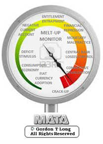
MELT-UPMONITORMeltup Monitor: Euro Pressure Going Critical - 28- Nov 2013 Meltup Monitor: A Regression-to-the-Exponential Mean Required - 25 Nov 2013
NEW SERIES RELEASE
Lance Roberts Charles Hugh Smith John Rubino Bert Dohman & Ty Andros NOW SHOWING HELD OVER MONETARY MALPRACTICE MONETARY MALPRACTICE: Deceptions, Distortions and Delusions MONETARY MALPRACTICE: Moral Malady MONETARY MALPRACTICE: Dysfunctional Markets HELD OVER Currency Wars Euro Experiment Sultans of Swap Extend & Pretend Preserve & Protect Innovation Showings Below
|
RECAP
Week Ending Jan. 12th, 2014 |
MACRO WATCH Q1 2014 NOW AVAILABLE - SUBSCRIBE �
|
Reading the right books?
We have analyzed & included
Book Review- Five Thumbs Up

| |||||||||||||||||||||||||||||||||||||||||||||||||||||||||||||||||||||||||||||||||||||||||||||||||||||||||||||||||||||||||||||||||||||||||||||||||||||||||||||||||||||||||||||||||||||||||||||||||||||||||||||||||||||||||||||||||||
|
||||||||||||||||||||||||||||||||||||||||||||||||||||||||||||||||||||||||||||||||||||||||||||||||||||||||||||||||||||||||||||||||||||||||||||||||||||||||||||||||||||||||||||||||||||||||||||||||||||||||||||||||||||||||||||||||||||||


"BEST OF THE WEEK " |
Posting Date |
Labels & Tags | TIPPING POINT or 2013 THESIS THEME | |||
| MOST CRITICAL TIPPING POINT ARTICLES THIS WEEK - January 4th - January 11th | ||||||
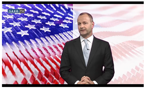
GREAT REFLATION ASSET VALUATIONS - Risk And Reality In The US Economy "We're at the end of Asset Inflation and that will dawn on the market very soon." Risk And Reality In The US Economy 12-24-13 Saxo Bank via ZH The US economy is stabilizing, but it's not truly recovering. That's the view of Saxo Bank's Chief Investment Officer, Steen Jakobsen. Following the Fed's tapering news, Steen says the risk is that we trade on perception and not reality. Clearly, the outgoing Fed Chairman, Ben Bernanke, wanted to send a signal to the markets. Global equity markets, notably in the States, have been hitting record highs for weeks; but Steen warns "we're coming to the end of that cycle."
"We're at the end of asset inflation," he says, and that "will dawn on the market very soon."
|
01-06-14 |
US CANARIES |
19 - US Stock Market Valuations | |||
GREAT REFLATION HOUSING - The Real Cost of Buying a Home 6.7 X Average Salary Spot The Paradox 12-24-13 Zero Hedge Based on the median real income, home prices have never been more unaffordable at a stunning 6.7x average salary. |
01-06-14 | US CATALYST-HOUSING | 26 - Rising Inflation Pressures & Interest Pressures | |||
| TO TOP | ||||||
| MACRO News Items of Importance - This Week | ||||||
GLOBAL MACRO REPORTS & ANALYSIS |
||||||
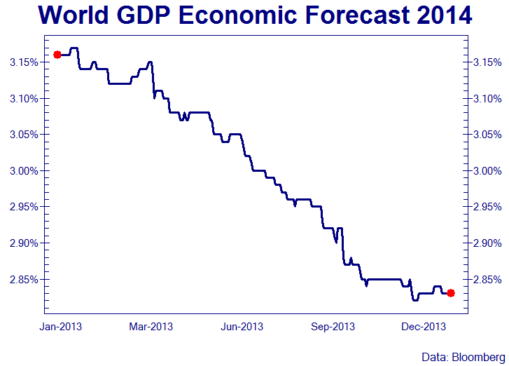
SIGNIFICANT REDUCTION IN THE GLOBAL GDP GROWTH FORECAST |
||||||
ITS A DIFFERENT WORLD THAN MOST YET FULLY APPRECIATE. |
01-08-14 | GLOBAL-GEO-POLITICAL-GROUP-EMERGING_MARKETS | GLOBAL MACRO |
|||
| 01-07-14 | MACRO--PATTERNS | GLOBAL MACRO |
||||
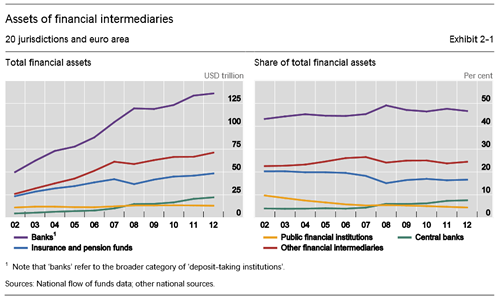
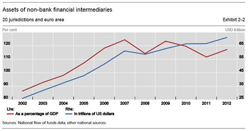
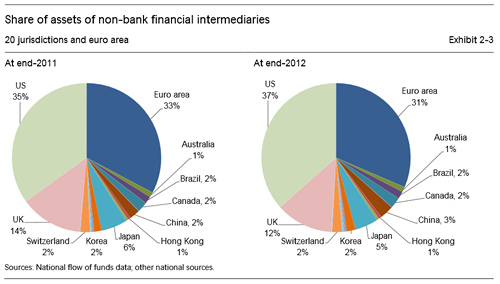
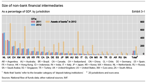
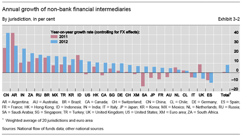
SHADOW BANKING - $71T and Now Bigger than the Global Economy SIZING THE GLOBAL SHADOW BANKING SYSTEM FSB's Global Shadow Banking Monitoring Report 2013 11-14-13 BIS The main findings from the 2013 exercise are as follows :
|
01-07-14 | MACRO MONETARY | GLOBAL MACRO |
|||
SHADOW BANKING: Why the Fed Can't Stop Fueling The Shadow Bank Why the Fed Can't Stop Fueling The Shadow Bank Kiting Machine 06-03-13 Bill Frezza via Menckenism blog Fractional reserve banking is unlike most other businesses. It's not just because its product is money. It's because banks can manufacture their product out of thin air. Traditional commercial banks essentially create money through a well understood and time honored pyramiding of loans. Depositors who understand that their deposits are thereby placed at risk choose their banks accordingly. Under the bygone rules of free market capitalism, only one thing kept banks from creating an infinite amount of money, and that was fear of failure. Failure occurs when depositors come to believe that their bank has lent out too much manufactured money to too many dodgy borrowers and may not be able to cover depositors’ withdrawals. When this happens, depositors rush to reclaim their money while there is still some left, leading to the bank’s collapse. Under free market capitalism, banks compete along a spectrum of risk and reward. Conservative banks offer a higher degree of safety by maintaining larger reserves, thereby manufacturing and lending out less money. Through word and deed they let depositors know that they lend to only the most creditworthy borrowers, who generally must post valuable collateral. These banks remain profitable because they successfully attract prudent depositors willing to accept lower rates of interest. Banks of a more speculative bent offer a lower degree of safety, maintaining smaller reserves to create and lend out more money. Seeking higher returns, they often lend to less creditworthy borrowers who may put up poor quality collateral or none at all. These banks attract risk-taking depositors looking for a higher rate of interest. They can be very profitable during periods of economic expansion but often fall into distress during economic downturns. Periodic bank failures remind depositors of the connection between risk and reward. When caveat emptor rules, smart depositors who pay attention make money and dumb depositors who don't lose theirs. Because the latter outcome is intolerable in a democracy, we have government-provided deposit insurance and other taxpayer-financed backstops that shield most depositors from the risk of loss. In theory banks pay premiums to fund this insurance. In practice these premiums are not risk-based. Banks are not penalized for making riskier loans, in turn often leaving the premiums too low to finance payouts. This creates a huge moral hazard, as it frees depositors to seek the highest return without regard for safety. Worse, it removes conservative banks’ competitive advantage. Under a government-guaranteed deposit insurance regime, conservative bankers who want to stay in business must take on more risk in order to pay the higher interest rates necessary to attract depositors. This often sets off a race to the bottom, which results in periodic banking crises. After each of these crises, politicians promise taxpayers that it will never happen again. And each time it does, the government creates a new set of labyrinthine regulations that attempt to mimic the business judgment of conservative bankers. Minimum reserve requirements are established, which normally become the maximum as there is little advantage in exceeding them. And both depositors and the bankers themselves become complacent about the banks’ investments because it is so easy to privatize gains and socialize losses. Banks also learn that competitive advantage can be obtained by either gaming the regulations or having cronies write them. As regulations get more intrusive and complex, politicians discover that they can be used to advance social policies, such as increasing home ownership among voters with poor credit, thereby increasing the risk on banks’ loan books. This mixed economic system is the one that replaced free market capitalism in hopes that it would prevent bank failures. Despite, and some even say because of, a regulatory regime that discouraged conservative banking and rewarded reckless mortgage lending, the banking system crashed - again - in 2007-2008. What is not widely appreciated is that the ensuing government bailouts allowed an underlying shadow banking system to not only survive but grow even larger. It is called the shadow banking system because it operates outside most government-regulated banking laws. This is primarily because regulations and accounting standards haven’t caught up with the practices of these banks, which are relatively new and poorly understood. It was the seizing up of the commercial paper and repo markets that funds the shadow banking system that abruptly halted the flow of liquidity that kept the mortgage bubble propped up. This revealed the underlying insolvency of Fannie Mae, Freddie Mac, and many commercial banks stuffed with subprime mortgage securities accumulated under the mixed economic system described above. Powered by an exclusive club of primary reserve dealers, a group that once included high flyers like Lehman Brothers, MF Global, and Countrywide Securities, these shadow banks work hand in glove with the Federal Reserve to manufacture money by pyramiding loans atop the base money deposits held in their Federal Reserve accounts. To the frustration of Keynesians, and despite an unprecedented Quantitative Easing (QE) by the Federal Reserve, conventional commercial banks have broken with custom and have amassed almost $2 trillion in excess reserves they are reluctant to lend as they scramble to digest all the bad loans still on their books. So most of the money manufactured today is actually being created by the shadow banks. But shadow banks do not generally make commercial loans. Rather, they use the money they manufacture to fund proprietary trading operations in repos and derivatives. |
01-07-14 | MACRO MONETARY | GLOBAL MACRO |
|||
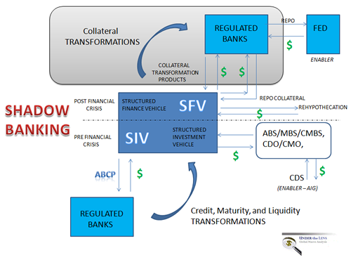
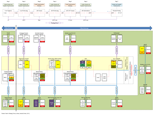
EMERGING WORLD: COLLATERAL TRANSFORMATIONS, REHYPOTHECATION & SFV's
ABOVE SCHEMATIC FROM : GLOBALIZATION TRAP by GordonTLong.com It is critically important to distinguish the interconnectedness between banks and different types of shadow banking entities. Different shadow banking entities are associated with different risk factors such as credit intermediation, maturity transformation, and leverage.
Excerpt below taken from: Why the Fed Can't Stop Fueling The Shadow Bank Kiting Machine Bill Frezza via Menckenism blog
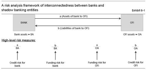
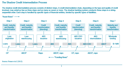
SHADOW BANKING - NEW YORK FEDERAL RESERVE - The Definitive Work on Shadow Banking & The Financial Crisis Shadow banks are best thought along a spectrum. Each of the seven steps involved in the shadow credit intermediation process were performed by many different types of shadow banks, with varying asset mixes, funding strategies, amounts of capital and degrees of leverage.
The Post-Crisis Backstop of the Shadow Banking System - Pozsar, Adrian, Ashcraft, Boesky (2010) Once private sector credit and liquidity put providers' ability to make good on their "promised" puts came into question, a run began on the shadow banking system. Central banks generally ignored the impairment of such important pillars of the shadow banking system as mortgage insurers or monoline insurers. Once the crisis gathered momentum, however, central banks became more engaged. The series of 13 liquidity facilities implemented by the Federal Reserve and the guarantee schemes of other government agencies essentially amount to a 360º backstop of the shadow banking system. The 13 facilities can be interpreted as functional backstops of the shadow credit intermediation process. Thus,
Only a few types of entities were not backstopped by the crisis, and some attempts to fix problems might have exacerbated the crisis . Examples include not backstopping the monolines early on in the crisis (this might have tamed the destructiveness of delevera ging) and the failed M-LEC which ultimately led to a demarcation line between bank-affiliated and standalone ABS intermediaries (such as LPFCs or credit hedge funds) as recipients and non-recipients of official liquidity. These entities failed too early on in the crisis to benefit from the liquidity facilities rolled out in the wake of the bankruptcy of Lehman Brothers, and their demise may well have accelerated and deepened the crisis, while also necessitating the creation of TALF to offset the shrinkage in balance sheet capacity for ABS from their demise.
These appendixes, which depict graphically the processes described in the article, offer a comprehensive look at the shadow banking system and its many components.
|
01-07-14 | MACRO MONETARY | GLOBAL MACRO |
|||
US ECONOMIC REPORTS & ANALYSIS |
||||||
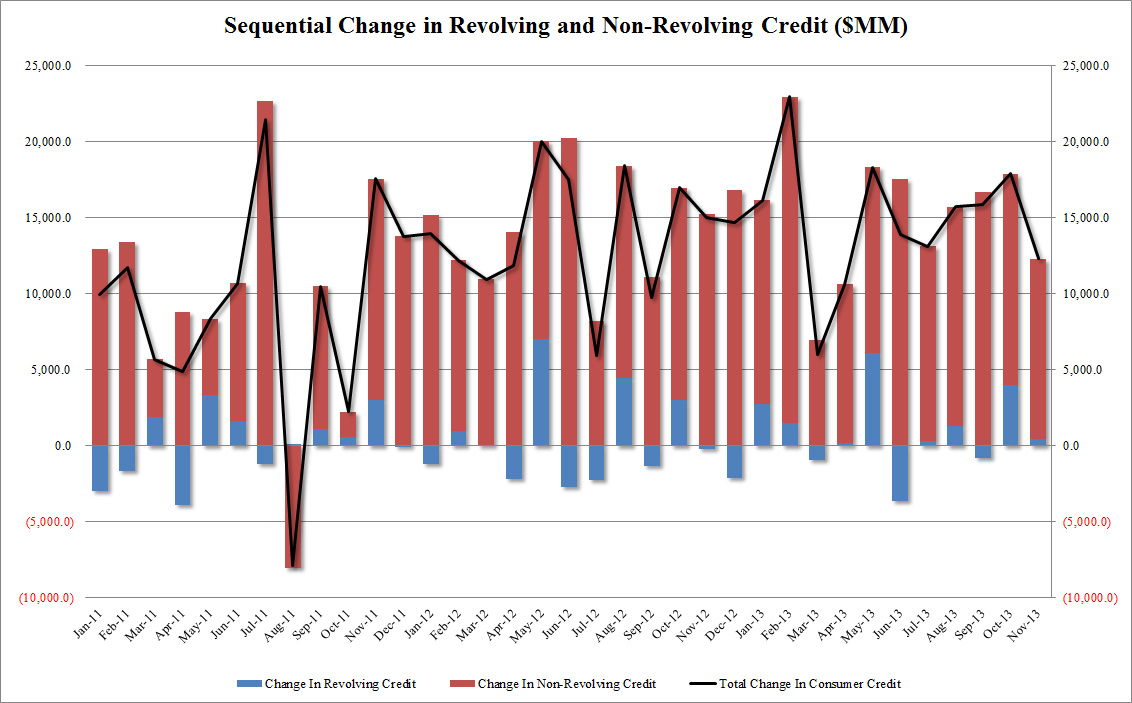
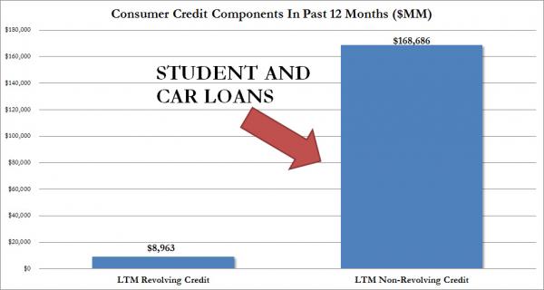
CONSUMER CREDIT - 95% of Lending Going Towards Student & Car Loans 95% Of Total Consumer Credit Lent In Past 12 Months Is For Student And Car Loans 01-08-14 Zero Hedge Another month, another disappointment for all those who hope the consumer will finally "charge it." In November, consumer credit was expected to grow by $14.25 billion, instead it rose by $12.318 billion. However, it was once again the components that were key, because while $11.9 billion or the vast majority of November's credit growth was in the form of car and student loans (i.e., non-revolving), a tiny $458 million was for revolving, or credit card, purchases.
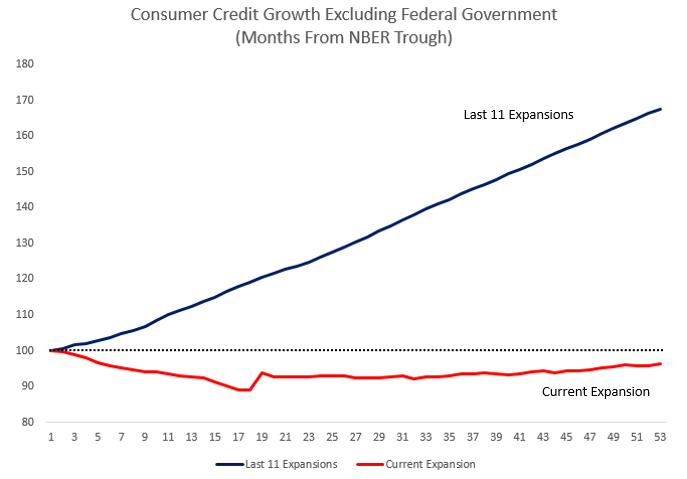
That's the demand side. On the supply side, no surprises here, the bulk of credit creation continues to come from the Federal Government whose contribution can be seen on the chart below courtesy of @Not_Jim_Cramer. In fact, if one excludes the contribution of the Federal government and compares how the current "expansion" matches to the last 11, well... instead of describing it see for yourselves:
Finally, putting it all into perspective, of the total $178 billion in consumer credit expansion in the past 12 months, a tiny $9 billion, or just 5% of total, was to fund credit card purchases. The rest went - you guessed it - into purchases of cars and paying for tuition, for which GM and strateospheric college tuitions are most grateful. And that is the New Normal economy in a nutshell. |
01-09-14 | US-MONETARY-CREDIT | US ECONOMICS |
|||
 |
01-09-14 | US-FISCAL | ||||
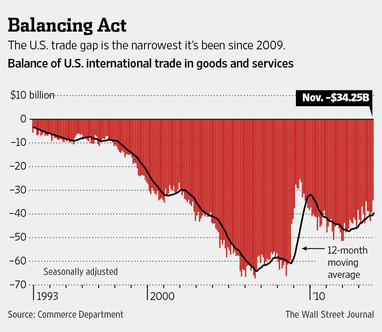
TRADE BALANCE SHRINKING SINCE 2008 Hiding a Reduced Ability to Consume and Finance |
01-09-14 | US-MONETARY | ||||
| 01-08-14 | US FISCAL | US ECONOMIC |
||||
| CENTRAL BANKING MONETARY POLICIES, ACTIONS & ACTIVITIES | ||||||
| Market | ||||||
| TECHNICALS & MARKET |
|
|||||
WEEKEND FOCUS VALUATIONS |
||||||
GLOBAL VALUATIONS - Disconnect from G10 Macro Are Global Stock Cheap? 01-10-14 Zero Hedge Ex-Morgan Stanley-ite Gerard Minack notes, equity markets in 2013 appeared to completely ignore macro fundamentals. Even Goldman Sachs is starting to question the sanity of its clients hopes and dreams...
|
01-11-14 | MACRO--FUNDAMENTALS-VALUATIONS | ||||
GLOBAL VALUATIONS - US Is The Most Expensive Developed Market In The World 5 Things To Ponder: Markets, Valuations & Investing Excerpted from: 01-10-14 Lance Roberts of STA Wealth Management, via ZH The US Is The Most Expensive Developed Market In The World via Zero Hedge
[Note: The reference to "cash on the sidelines" is part of Cliff Asness' 10 Pet Peeves which is a must read for any investor.] For more charts from JP Morgan on market valuation go here. |
01-11-14 | MACRO--FUNDAMENTALS-VALUATIONS- |
||||
VALUATIONS - Market Cap-v-GDP Warren Buffett Once Said This Was The 'Best Single Measure' Of Stock Market Value 01-09-14 Doug Short via BI From time to time I'm asked why I don't include Market Cap to GDP among the long-term valuation indicators I routinely follow. The metric gained popularity in recent years thanks to Warren Buffett's remark in a 2001 Fortune Magazine interview that "it is probably the best single measure of where valuations stand at any given moment." My friend and guest contributor Chris Turner offered some analysis along those lines last year using the S&P 500 as the surrogate for the market (When Warren Buffett Talks ... People Listen). For a broader measure of Market Cap, VectorGrader.com uses line 36 in the Federal Reserve's B.102 balance sheet (Market Value of Equities Outstanding) as the numerator. Since both GDP and the Fed's data are quarterly, the folks at VectorGrader.com do some interpolation and extrapolation to produce monthly estimates. Their latest chart is available to the general public here. The four valuation indicators I track in my monthly valuation overview offer a long-term perspective of well over a century. The raw data for the "Buffett indicator" only goes back as far as the middle of the 20th century. Quarterly GDP dates from 1947, and the Fed's B.102 Balance sheet has quarterly updates beginning in Q4 1951. With an acknowledgement of this abbreviated timeframe, let's take a look at the plain vanilla quarterly ratio with no effort to interpolate monthly data or extrapolate since the end of the most recent quarterly numbers. Here is a chart I created using the Federal Reserve Economic Data (FRED) data and charting tool. That strange numerator in the chart title, MVEONWMVBSNNCB, is the FRED designation for Line 36 in the B.102 balance sheet (Market Value of Equities Outstanding), available on the Federal Reserve website here in PDF format. For those of you who may have reservations about the Federal Reserve economists' estimation of Market Value, I can offer a more transparent alternate snapshot over a shorter timeframe. Here is the Wilshire 5000 Total Market Full Cap Index divided by GDP, again using the FRED repository charting tool. A quick technical note: To match the quarterly intervals of GDP, for the Wilshire data I've used the quarterly average of daily closes rather than quarterly closes (slightly smoothing the volatility). The vertical axis in the chart above is the result of using an index scale for GDP set to 100 at the US Recession Peak in December 2007. I also used the 2007 date for the Wilshire index. Regardless of how you chain the index values, the chart contour is unaffected. Here is a link to the FRED page containing my calculations. What Do These Charts Tell Us? Both the "Buffett Index" and the Wilshire 5000 variant suggest that today's market is at lofty valuations. In fact, the latest quarter in the Wilshire version is the third highest in its history, fractionally topped by two quarters in 2000. |
01-11-14 | US--FUNDAMENTALS-VALUATIONS |
||||
VALUATIONS - Pension Funding Here's The Big Tailwind To Corporate Profit Margins That Everyone Has Forgotten 01-11-14 BI Corporate profit margins for S&P 500 companies are at all-time highs. And the bulls insist that margins are at least sustainable over the near-term. They remind us that labor market slack will keep wage cost growth limited, deleveraging will limit the impact of higher interest rates, and increasing overseas exposure will keep overall taxes and operating costs low. Deutsche Bank's David Bianco is one of these bulls who sees net profit margins going even higher in 2014. At a breakfast on Thursday, Bianco reminded us that pension expenses will be substantially lower. Remember, during the financial crisis, asset values plunged sending pension funds deep into under-funded status. As a result, corporations had to pour increasing amounts of money into these pensions to help bring them closer to fully funded status. And that was recognized on the income statement as higher pension expenses, which put pressure on profit margins. But thanks to the help of an unexpectedly powerful recovery in stocks, these funds are nearly back to pre-crisis levels. "Pension plan funding status at 2013 end vs. 2012 end will affect 2014 EPS," said Deutsche Bank's David Bianco in his 2014 outlook note. "Our 2014E S&P EPS of $119 includes $1.50 of lower pension costs, but it could easily be anywhere from a $1.00 to $2.00." That is a massive relief for corporate costs. But doesn't this just mean that the next stock market pullback will slam margins again? Not likely. Keep in mind that most companies have shifted from offering defined benefit plans (i.e. pension plans) to offering defined contribution plans (e.g. 401k plans), which puts all of the investment risks squarely on the employee. Those on pension plans will soon retire, which means pension fund managers will be scaling back risk (i.e. selling stocks and moving into bonds). Here's Bianco with more commentary:
The outflows fly in the face of the popular "great rotation" theme, the shift from bonds to stocks that some argue is a big bullish force for the stock market. Bianco isn't convinced these pension fund outflows won't be large enough to put the stock market at risk.
A few years ago, everything about pension funds spelled trouble. It's nice to hear things have turned around.
|
01-11-14 | MACRO--FUNDAMENTALS-VALUATIONS |
||||
CREDIT CRACKS - Early Warning Signals in the SWAPS Market This Weeks Credit Action Last year’s almost 30 percent return in the Standard & poor’s 500 index may cause traders to doubt a repeat performance in 2014. Rising spreads in swaps and global CDS indexes yesterday may at least signal a bumpy start to the year. WARNING SIGNALS The five-year U.S. swap spread, a popular gauge of credit risk, widened to 7 basis points yesterday from 3 basis points in late December — a small but important change. The swap spread appears to be experiencing one of the largest price dislocations in five years, based on a normalized comparison with the markit CDX north america investment grade index and the VIX index since 2009. This may suggest greater volatility lies ahead. Rising swap spreads indicate an imbalance in the counterparties seeking to receive a floating rate and pay a fixed rate, which means traders may increasingly expect rate increases to come earlier. Federal Reserve meeting minutes released yesterday and a better-than-expected ADP U.S. employment report help explain the widening spread. Widening swap spreads frequently correspond with declining equity indexes as well as widening spreads on corporate bonds, which the chart below shows.
REMEMBER
30 DAY ARBITRAGE-FREE CASH HAZARD RATE IS IMPORTANT |
01-09-14 | US--PATTERNS-CREDIT | ||||
PATTERNS - Mid Term Election Year Pattern MID TERM ELECTION YEAR PATTERN This follows very closely our 2014 Technical Pattern Outlook SOURCE: Chart of the Day 12-24-13 The chart illustrates how the stock market has performed during the average mid-term election year. Since 1950, the first nine months of the average mid-term election year have tended to be subpar (see thick blue line). That subpar performance was then followed by a significant year-end rally. One theory to support this behavior is that investors abhor uncertainty. To that end, investors tend to pull back prior to an election when the outcome is unknown. Beginning in early October, however, the outcome of the election becomes increasingly apparent and investors respond by positioning their portfolios accordingly.
|
01-06-14 | PATTERNS | ||||
PATTERNS - Sornette's Log-Periodic Model Prediction Peak Speculation And The Ides Of January 14th 01-05-14 Via John Hussman, Confidence abounds. Last week, Investor’s Intelligence reported a surge in advisory sentiment to the highest bullish percentage since October 19, 2007. John Hussman notes that NAAIM reported that the 3-week average equity exposure among its members increased to the highest level on record. Given the unfortunate resolution of similarly extreme overvalued, overbought, overbullish, rising-yield periods in history, it's almost mind-boggling that investors actually expect the present speculative run to end well. The accelerating pitch and shallowing corrections of the recent advance are worth noting. Based on the fidelity of the recent advance to this price structure, we estimate the “finite-time singularity” of the present log-periodic bubble to occur (or to have occurred) somewhere between December 31, 2013 and January 13, 2014. That does not mean that prices must immediately crash – only that the dynamics will then lend themselves to a great deal of potential instability, if prior log-periodic bubbles in equity and commodity markets across history are any indication. It bears repeating that our own defensiveness is driven by a broad ensemble of evidence, not simply price dynamics, not simply valuations, not simply sentiment, but the “full catastrophe” – which includes the fact that strong economic, speculative and monetary enthusiasm has historically been quite a contrary indicator for stocks. The chart below shows the current position of the S&P 500. The light red line shows the log-periodic price trajectory that most closely approximates the present overvalued, overbought, overbullish, Fed-induced speculative run since 2010. While the initial gains from the 2009 low until about mid-2010 represented what we view as a move from reasonable valuation to full valuation (our stress-testing “miss” was not on valuation grounds), I expect little, if any of the market’s gains since 2010 to be retained by investors over the completion of this market cycle. Despite very short-run uncertainties about market direction, I should note that we now estimate negative prospective total returns for the S&P 500 on every horizon of less than 7 years. And this is what Hussman said in 2007...
Sound familiar?
|
01-06-14 | PATTERNS | ||||
| COMMODITY CORNER - HARD ASSETS | PORTFOLIO | |||||
| COMMODITY CORNER - AGRI-COMPLEX | PORTFOLIO | |||||
| SECURITY-SURVEILANCE COMPLEX | PORTFOLIO | |||||
| THESIS Themes | ||||||
2013 - STATISM |
||||||
2012 - FINANCIAL REPRESSION |
||||||
2011 - BEGGAR-THY-NEIGHBOR -- CURRENCY WARS |
||||||
2010 - EXTEND & PRETEND |
||||||
| THEMES | ||||||
| NATURE OF WORK -PRODUCTIVITY PARADOX | ||||||
| GLOBAL FINANCIAL IMBALANCE - FRAGILITY & INSTABILITY | ||||||
| CENTRAL PLANINNG -SHIFTING ECONOMIC POWER | ||||||
| SECURITY-SURVEILLANCE COMPLEX -STATISM | ||||||
| STANDARD OF LIVING -GLOBAL RE-ALIGNMENT | ||||||
| CORPORATOCRACY -CRONY CAPITALSIM | ||||||
CORRUPTION & MALFEASANCE -MORAL DECAY - DESPERATION, SHORTAGES.. |
||||||
| SOCIAL UNREST -INEQUALITY & BROKEN SOCIAL CONTRACT | ||||||
| CATALYSTS -FEAR & GREED | ||||||
| ECHO BOOM - PERIPHERAL PROBLEM | ||||||
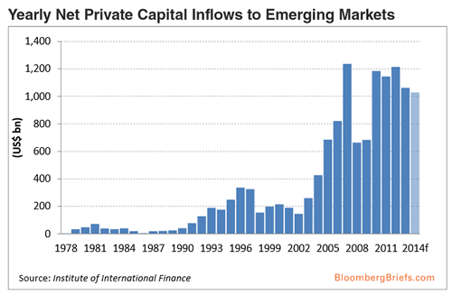
ECHO BOOM - The Capital Flow Proxy Index EM Capital-Flow Proxy Index Suggests Slower Pace 01-07-14 Bloomberg Brief The trend in private capital flows to emerging markets (EM) economies appears to follow a rhythm of extended periods of successively larger capital inflows then followed by sudden sharp declines that erase a significant portion of the prior period’s gains. In a typical capital-flow up-cycle, higher expected returns on EM assets begin to gradually attract capital to EM economies, with global fund managers often taking a wait-and-see approach before committing large sums to EM assets and investment strategies. This built-in inertia gives rise to a gradual adjustment in portfolio allocations to EM assets, thus creating a timeline of long runs in capital flows to EM economies. When market conditions eventually turn less favorable, the unwinding of speculative positions often triggers a major reversal in capital inflows and a serious decline in the performance of EM assets. Estimates by the Institute of International Finance show that net private capital flows to EM economies were quite weak in the 1980s, evidently reflecting investor concern about the Latin American debt crisis at that time. Net private capital flows to EM economies began to pick up in the first half of the 1990s, but enthusiasm for EM assets tumbled later in the decade in the wake of the Asian and Russian financial crises.
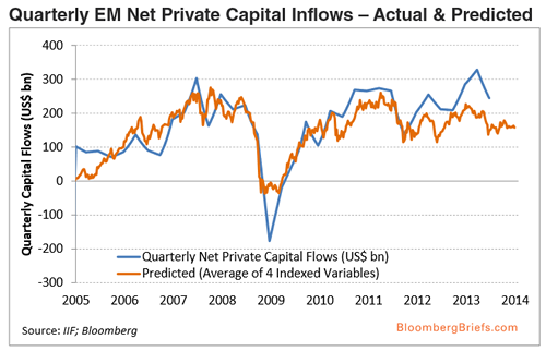
It wasn’t until 2003 that net capital flows to EM economies began to pick up in earnest, rising nearly six-fold to more than $1.2 trillion per annum in 2007 from an average of around $200 billion in 1999-2002. In the fallout from the global financial crisis, EM net private inflows plummeted by nearly 50 percent to $600 billion in 2008-09 before regaining much of their lost ground once global financial stress was alleviated and global investor risk appetite recovered in 2010-13. If there is evidence of momentum in capital flows to EM economies, this information may prove useful in forecasting the future trend in flows and could help investors in deciding whether to remain fully invested in EM -related investment strategies. Due to the scarcity of high-frequency flow data necessary for portfolio-management purposes (balance of payment statistics are often reported with a considerable lag), we decided to take a different approach to tracking EM capital-flow momentum. We found that because EM capital flows tend to be driven by relative expected returns on EM bonds, equities, and currencies as well as global commodity prices, we could construct a high-frequency composite index that both tracks the returns on EM assets and, in the process, serves as a proxy measure of the trend in EM capital flows.
Assets and strategies that perform well tend to attract more capital from overseas, while assets and strategies that perform poorly tend to compel global investors to exit such trades and allocate their funds to other (safer) assets and strategies. Nevertheless, there is likely to be some slippage in the relationship between EM capital flows and daily EM asset-price performance, and as such we would not expect our proxy measure to give us a precise fix on EM capital flows on a high- frequency basis. A proxy capital-flow measure based on the current trend in asset-price performance should best be viewed as a contemporaneous measure of net private capital flows to EM economies, not a leading indicator of the path that capital flows are likely to take in the future. To the extent that EM capital flows exhibit significant trend persistence or upside momentum, however, the lagged trend in our EM capital-flow proxy index might offer a hint as to the likely direction that EM capital flows will take in the future. As such, the recent poor performance of EM asset prices suggests that EM capital flows are likely to run at a slightly slower pace in the early months of 2014. We see two potential hurdles for EM capital flows in 2014.
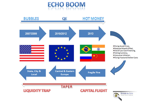
The Schematic below is from Gordontlong.com as reference to the above. Sign Up for the 2014 THESIS - The Globalization Trap
|
01-08-14 | THEMES | ECHO BOOM |
|||
| GENERAL INTEREST |
|
|||||
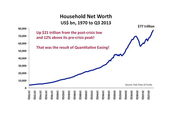
FLOWS - Wealth Effect & US Household Net Worth
The Fed is driving the economy by pushing up stock prices and home prices so that Americans will have more money to spend even though the median income is falling. It has the tools and, it appears, the determination to continue doing this. I believe the Fed’s goal is to:
They have a good chance of succeeding at this for the next couple of years. That should be good news for investors. Now, for the details. Here’s how it works.
Globalization is very deflationary and that is offsetting the inflationary pressures caused by fiat money creation. 'TAPPING ON THE BREAKS' TO SIT EVERYONE DOWN Back in April, with the yield on the 10-year government bond below 1.7%, interest rates were too low and they were causing property and stock prices to climb too rapidly. To prevent a new bubble from forming, the Fed began suggesting it would soon start to taper its pace of bond purchases. The market immediately responded to that threat by selling bonds. That caused the yield on the 10-year bond to rise to 3.0% even before the Fed had actually done anything. The Fed did not want interest rates to rise that sharply. It feared that interest rates at that level would cause asset prices to stop rising – or maybe even fall. So, on September 18th, it pushed back its tapering timeframe. As a result, the 10-year bond yield fell back to 2.6%. It is clear that the Fed will continue printing $85 billion a month and buying bonds until the 10-year bond yield falls to its desired level (as defined above). The chances look good that the Fed is going to be able to get what it wants, i.e. higher asset prices. And that should keep alive the favorable investment environment that investors have benefited from since QE 3 was announced one year ago. The Fed played a leading role in creating this global economic crisis. Despite that, I also believe that their current policy of Quantitative Easing is now practically the only thing preventing this credit bubble from collapsing into a severe depression. A HOT AIR BALLOON We are all in a hot air balloon that was created by the Fed, and we are floating miles above solid ground. We blame the Fed for getting us into the hot air balloon but, at the same time, we’re praying that the Fed will keep our balloon inflated – because the alternative involves crashing to our deaths. There are those who say that the fall is inevitable, therefore the sooner we get it over with the better. That is a view that can only be supported by people who badly underestimate how far we have to plunge. Otherwise, it would be akin to asserting that since death is inevitable we should all commit suicide today. A correct understanding of how vast the distance is between us and the ground demands that every effort be made to keep us afloat for absolutely as long as possible. My view is that if we can stay afloat long enough, we might just have time to build another means of transportation to take us off this balloon and safely where we want to go. That hope may prove to be merely a fantasy. Even so, even if the worst can’t be averted forever, I would still prefer to enjoy the view for a few more years before that time arrives. And, by the look of things, the Fed seems to feel the same way. POST FINACIAL CRISISSeptember 15th is the fifth anniversary of the bankruptcy of Lehman Brothers. Let’s consider what’s changed during the five years since the meltdown of the financial sector brought the world to the brink of a new great depression.
So, what should we conclude from these facts? The obvious conclusion is that Creditism has survived and that the bankers still rule! Our economic system has evolved from Industrial Capitalism, a system in which wealth was primarily derived from the manufacturing process, to Creditism, a system in which wealth is primarily derived from credit creation.
It should not be forgotten that whoever creates the wealth controls the political power. Practically, what does this mean for our future? In the near term, it probably means that property and stocks prices are going to continue going up. The Financial Industry, the dominant political power, can be counted on to make sure that policies are enacted by the government that will benefit the Financial Industry. And, what the Financial Industry requires above all else in order to make money is for credit to expand. If credit expansion is going to be sustainable, however, whoever borrows the money has to have the means of eventually repaying it. Since 2008, it has been the $7 trillion increase in government debt that has allowed credit to expand. Now that the budget deficit is falling sharply (by approximately 40% this year) due to sequestration and higher taxes, the government will borrow much less. That means some other sector of the economy will have to be encouraged to, incentivized to, in short, made to borrow much more. And that sector will have to be the Household Sector – in other words, people like you. But the median income of the Household Sector is falling. So, if that sector is going to be able to service the interest expense on its new debt, the value of its assets (homes and stock portfolios) will have to be made to increase. As those assets appreciate in value, their owners will be able to borrow against them and, thereby, be able to pay the interest on the money they borrowed earlier. So, as I see it, the Financial Industry will use all its immense political influence to make sure that the government (including the Fed) takes whatever actions necessary to force home prices and stock prices to continue to rise. At present, Quantitative Easing is having the desired effect of pushing up asset prices. I expect this to continue. The Fed will soon begin to “taper” its pace of fiat money creation from its current rate of $85 billion a month, but it is very unlikely (in my opinion) to taper so much that asset prices stop rising. Creditism is an economic system that requires credit growth to survive. It is managed at the macro level by the government, over which the Financial Industry holds dominate political sway. This system is inherently unstable and, in all likelihood, unsustainable over the long run. That said, it would probably be a grave mistake to bet on it collapsing any time soon. Therefore, it would be wise to attempt to understand how this system works and how it is likely to evolve from here. SOMETHING QUITE EXTRAORDINARY An extraordinary thing has happened. The United States budget deficit improved dramatically in FY2013; and it did so without hurling the US economy into a severe recession.
As a percentage of GDP, the budget deficit declined by 2.7 percentage points from 6.8% of GDP in FY2012 to 4.1% of GDP in FY2013. It peaked at 9.8% of GDP in FY2009. Under normal circumstances such a sharp reduction in the budget deficit would have caused the GDP to be at least 2.7 percentage points lower (and probably closer to 4.0 percentage points lower, taking into consideration the multiplier effect) than it otherwise would have been. The increase in taxes would have reduced personal consumption, while the reduction in government spending would have directly reduced the size of the economy. This would almost certainly have thrown the economy into recession. The fact that the US economy still managed to grow by an average of 1.6% during the last four quarters can only be explained by one thing: Quantitative Easing. During FY2013, the Fed created nearly $1 trillion of fiat money, an amount roughly equivalent to 6% of GDP. It injected that money into the economy by buying government bonds and mortgage backed securities. In this way, QE pushed up asset prices, most notably the price of stocks and property; and rising asset prices created a wealth effect that fuelled consumption and economic growth - despite the severe government austerity. Before discussing the budget in greater detail, I would like to point out here that It is very important for investors to monitor the size of the US budget deficit relative to the size of QE. The government's budget deficit sucks liquidity out of the economy. QE pumps it in. When QE is larger than the budget deficit - as it is now - there is a great deal of excess liquidity that tends to push asset prices higher. I have developed a "Liquidity Gauge" to measure the extent to which liquidity is excessive or inadequate. For a full explanation of the Liquidity Gauge and how it can be used as a tool to anticipate the direction of asset prices, please see Macro Watch, Fourth Quarter 2013: http://www.richdad.com/Resources/Rich-Dad-Financial-Education-Blog/November-2013/announcing-macro-watch-richard-duncans-video-news.aspx Now, back to the budget. Here are some of the budget details that I believe are important and interesting.
Looking ahead, the Congressional Budget Office has forecast that the government's budget deficit will fall further in FY2014 to $560 billion or 3.4% of GDP. The decline in the budget deficit since FY2012 represents a very significant improvement in the United States finances over a very short period of time. The economy has weathered this fiscal austerity much better than could have been expected. Its next challenge will be to weather the end of the Fed's monetary largess. Things could soon get rough. QE tapering is fast approaching.
|
||||||
| TO TOP | ||||||
|
||||||


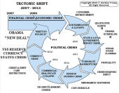
Tipping Points Life Cycle - Explained
Click on image to enlarge
TO TOP
 |
YOUR SOURCE FOR THE LATEST THINKING & RESEARCH
|
�
TO TOP