|
JOHN RUBINO'SLATEST BOOK |
|||||||||||||||||||||||||||||||||||||||||||||||||||||||||||||||||||||||||||||||||||||||||||||||||||||||||||||||||||||||||||||||||||||||||||||||||||||||||||||||||||||||||||||||||||||||||||||||||||||||||||||||||||||||||||||||||||||||||||||||||||||||||||||||||||||||||||||||||||||||||||||||||||||||||||
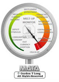
"MELT-UP MONITOR " Meltup Monitor: FLOWS - The Currency Cartel Carry Cycle - 09 Dec 2013 Meltup Monitor: FLOWS - Liquidity, Credit & Debt - 04 Dec 2013 Meltup Monitor: Euro Pressure Going Critical - 28- Nov 2013 Meltup Monitor: A Regression-to-the-Exponential Mean Required - 25 Nov 2013
|
"DOW 20,000 " Lance Roberts Charles Hugh Smith John Rubino Bert Dohman & Ty Andros
|
HELD OVER
Currency Wars
Euro Experiment
Sultans of Swap
Extend & Pretend
Preserve & Protect
Innovation
Showings Below
"Currency Wars "
|
"SULTANS OF SWAP" archives open ACT II ACT III ALSO Sultans of Swap: Fearing the Gearing! Sultans of Swap: BP Potentially More Devistating than Lehman! |
"EURO EXPERIMENT"
archives open EURO EXPERIMENT : ECB's LTRO Won't Stop Collateral Contagion!
EURO EXPERIMENT: |
"INNOVATION"
archives open |
"PRESERVE & PROTE CT"
archives open |

Mon. Jan. 5th, 2015
Follow Our Updates
on TWITTER
https://twitter.com/GordonTLong
AND FOR EVEN MORE TWITTER COVERAGE
STRATEGIC MACRO INVESTMENT INSIGHTS
 2014 THESIS: GLOBALIZATION TRAP
NOW AVAILABLE FREE to Trial Subscribers
185 Pages
What Are Tipping Poinits?
Understanding Abstraction & Synthesis
Global-Macro in Images: Understanding the Conclusions
![]()
| JANIUARY | ||||||
| S | M | T | W | T | F | S |
| 1 | 2 | 3 | ||||
| 4 | 5 | 6 | 7 | 8 | 9 | 10 |
| 11 | 12 | 13 | 14 | 15 | 16 | 17 |
| 18 | 19 | 20 | 21 | 22 | 23 | 24 |
| 25 | 262 | 27 | 28 | 29 | 30 | 30 |
KEY TO TIPPING POINTS |
| 1 - Risk Reversal |
| 2 - Japan Debt Deflation Spiral |
| 3- Bond Bubble |
| 4- EU Banking Crisis |
| 5- Sovereign Debt Crisis |
| 6 - China Hard Landing |
| 7 - Chronic Unemployment |
| 8 - Geo-Political Event |
| 9 - Global Governance Failure |
| 10 - Chronic Global Fiscal ImBalances |
| 11 - Shrinking Revenue Growth Rate |
| 12 - Iran Nuclear Threat |
| 13 - Growing Social Unrest |
| 14 - US Banking Crisis II |
| 15 - Residential Real Estate - Phase II |
| 16 - Commercial Real Estate |
| 17 - Credit Contraction II |
| 18- State & Local Government |
| 19 - US Stock Market Valuations |
| 20 - Slowing Retail & Consumer Sales |
| 21 - China - Japan Regional Conflict |
| 22 - Public Sentiment & Confidence |
| 23 - US Reserve Currency |
| 24 - Central & Eastern Europe |
| 25 - Oil Price Pressures |
| 26 - Rising Inflation Pressures & Interest Pressures |
| 27 - Food Price Pressures |
| 28 - Global Output Gap |
| 29 - Corruption |
| 30 - Pension - Entitlement Crisis |
| 31 - Corporate Bankruptcies |
| 32- Finance & Insurance Balance Sheet Write-Offs |
| 33 - Resource Shortage |
| 34 - US Reserve Currency |
| 35- Government Backstop Insurance |
| 36 - US Dollar Weakness |
| 37 - Cyber Attack or Complexity Failure |
| 38 - Terrorist Event |
| 39 - Financial Crisis Programs Expiration |
| 40 - Natural Physical Disaster |
| 41 - Pandemic / Epidemic |
Reading the right books?
No Time?
We have analyzed & included
these in our latest research papers Macro videos!
![]()
OUR MACRO ANALYTIC
CO-HOSTS
John Rubino's Just Released Book
Charles Hugh Smith's Latest Books
Our Macro Watch Partner
Richard Duncan Latest Books
MACRO ANALYTIC
GUESTS
F William Engdahl
OTHERS OF NOTE
Book Review- Five Thumbs Up
for Steve Greenhut's
Plunder!
TODAY'S TIPPING POINTS
|
Scroll TWEETS for LATEST Analysis
Read More - OUR RESEARCH - Articles Below
HOTTEST TIPPING POINTS |
Theme Groupings |
||||||||||||||||||||||||||||||||||||||||||||||||||||||||||||||||||||||||||||||
Investing in Macro Tipping Points
THESE ARE NOT RECOMMENDATIONS - THEY ARE MACRO COMMENTARY ONLY - Investments of any kind involve risk. Please read our complete risk disclaimer and terms of use below by clicking HERE |
|||||||||||||||||||||||||||||||||||||||||||||||||||||||||||||||||||||||||||||||
We post throughout the day as we do our Investment Research for: LONGWave - UnderTheLens - Macro |
|||||||||||||||||||||||||||||||||||||||||||||||||||||||||||||||||||||||||||||||
"BEST OF THE WEEK " |
Posting Date |
Labels & Tags | TIPPING POINT or THEME / THESIS or INVESTMENT INSIGHT |
||||||||||||||||||||||||||||||||||||||||||||||||||||||||||||||||||||||||||||
|
MOST CRITICAL TIPPING POINT ARTICLES TODAY
|
|
||||||||||||||||||||||||||||||||||||||||||||||||||||||||||||||||||||||||||||||
RISK - Dollar Danger The year of Dollar Danger for the world 01-01-15-Ambrose Evans-Pritchard, Telegraph We are entering a new financial order where there is no longer an automatic “Fed Put” or a “Politburo Put” to act as a safety net for asset markets US DOLLAR America’s closed economy can handle a:
Large parts of the world cannot. That in a nutshell is the story of 2015. Tightening by the US Federal Reserve will have turbo-charged effects on a global financial system addicted to zero rates and dollar liquidity. BRICS
CURRENCIES
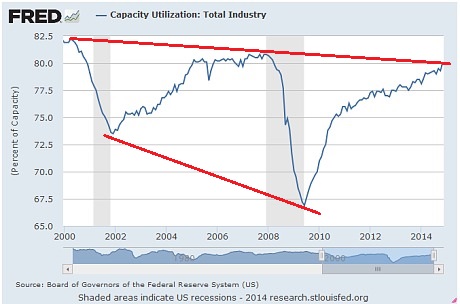
FEDERAL RESERVE POLICY The Yellen Fed will be forced to back down in the end, just as the Bernanke Fed had to retreat after planning a return to normal policy at the end of QE1 and QE2. For now the Fed is on the warpath, digesting figures showing US capacity use soaring to 80.1pc, and growth running at an 11-year high of 5pc in the third quarter.
CHINA The Fed pivot comes as China’s Xi Jinping is:
Uncle Xi will ultimately blink, but traders betting on a quick return to credit stimulus may lose their shirts first. Worse yet, when he blinks, a tool of choice may be to drive down the yuan to fight Japan’s devaluation, and to counter beggar-thy-neighbour dynamics across East Asia. This would export yet more Chinese deflation to the rest of the world. At best we are entering a new financial order where there is no longer an automatic “Fed Put” or a “Politburo Put” to act as a safety net for asset markets. That may be healthy in many ways, but it may also be a painful discovery for some. ENERGY SHOCK A sated China is as much to “blame” for the crash in oil prices as America’s shale industry. Together they have knouted Russia's Vladimir Putin. The bear market will short-circuit at Brent prices of $40, but not just because shale capitulates. Marginal producers in Canada, the North Sea, West Africa and the Arctic will share the punishment. The biggest loser will be Saudi Arabia, reaping the geostrategic whirlwind of its high stakes game, facing
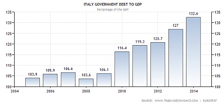
RUSSIA Mr Putin will achieve his objective of crippling Ukraine’s economy and freezing the conflict in the Donbass, but only by crippling Russia in the process. Controls will not stem capital flight. Mr Putin will have to choose been a dangerous loss of foreign reserves and a dangerous chain of corporate bankruptcies. He will continue to pawn Russia’s national interest to Beijing in order to save his Siloviki regime, but wiser heads in Moscow will question how a perpetual dispute with Europe and the revival of a dying NATO can possibly be in Russia’s interest. They will check his folly. EU The European Central Bank cannot save the day for asset markets as the Fed pulls back: It does not print dollars, and dollars are what now matter. Nor is it constitutionally able to act with panache in any case. While Mario Draghi and the Latin bloc could theoretically impose full-fledged QE against German resistance, such Frechheit would sap German political consent for the EMU project. Mr Draghi will accept a bad compromise: low-octane QE that makes no macro-economic difference, but noisy enough to provoke a storm. The eurozone will be in deflation by February, forlornly trying to ignite its damp wood by rubbing stones. Real interest rates will ratchet higher. The debt load will continue to rise at a faster pace than nominal GDP across Club Med. The region will sink deeper into a compound interest trap.
The political triggers for the next spasm of the EMU crisis are complex, yet trouble must come since the North-South gap is as wide as ever in key respects, and the depression drags on. The detonator may of course be Greece. If Syriza rebels hold their poll lead into the snap-election this month, a cathartic showdown with Brussels will occur in short order. The EU creditors may agree to debt forgiveness for Greece, but they might equally refuse to talk with a gun held to their heads. There is a 50/50 risk that they would instead switch off life-support and eject Greece, calculating that they now have the back-stop machinery to stop contagion. In this they would be wrong. EQUITY MARKETS Breaking my normal rule of discussing equity prices let me say only that the S&P 500 index of Wall Street stocks will not defy monetary gravity or the feedback loops of global stress for much longer. Half the earnings of US big-cap companies come from overseas, repatriated into a stronger dollar, and therefore worth less in reporting terms.
The index has risen at double-digit rates for three years, further inflated this year by
Expect a shake-out of 20pc comparable to the LTCM crisis in 1998 when the wheels came off in Russia and East Asia, though don’t be shocked by worse. Emerging markets are a much bigger part of the world economy today, and their combined debt ratio is a record 175pc of GDP. Once these hiccups are behind us, we can look forward to sunlit uplands as always. Happy New Year. |
01-05-15 | GLOBAL MACRO |
|||||||||||||||||||||||||||||||||||||||||||||||||||||||||||||||||||||||||||||
RISK - Commodities, Inflation Breakevens and Yield Curve Sending Clear Warnings Only Stocks Are Left Minding The 'Recovery' 01-03-15 Submitted by Jeffrey Snider via Alhambra Investment Partners, If I had to define the recovery period that developed after the trough in the Great Recession, it would have ended sometime in the middle of 2011. Up to that point, there was almost a uniform behavior in financial and even economic accounts (though, on the economic side, there was much left to be desired). It was by no means uneventful, as you would like in recoveries, but that was as much a systemic and structural problem as anything to do with cycle. That ragged end, as new doubts essentially replaced widespread hope, remains with us in a series of divergences that are only now closing (in the wrong direction). Given the central task of every central bank, subscribed to themselves, is essentially “inflation” that is a good place to start. INFLATION - About SUPPLY & FLOW of Money & Credit
Commodity prices and stocks were very much aligned coming out of the depths of panic, even through the major bumps in 2010 (including the flash crash and onset of Greece). The more serious outbreak of uncertainty and fear in 2011 was unable to dislodge the correlation, as both commodity prices and stocks gyrated, but at the same times and in the same directions both up and down. It wasn’t until early 2012 that any sustained divergence appeared. Whether this durable rift occurred early on in the year or later around QE3’s introduction is really irrelevant, only that the significant events of that year were these differing tacks in “inflation” while the global economy, including the US, dropped off the prior recovery path. COMMODITIES ANCHORED BY "DEMAND"
EQUITIES USED TO BE ANCHORED BY EARNINGS & EARNINGS GROWTH (Relative to Sales Growth)
If we add additional financial measures to the mix, these inflections start to line up with the historical record of significant events. Through periods A, B & C in the chart above, all the “market” indications are in agreement.
But that was essentially the frailty by which this divergence between stock “inflation” and commodity “inflation” was created. Period C was replete with massive intervention, including significant action at the ECB, BoJ and even the Fed ($ swaps) that, as we see very clearly now, had little to no effect on the real economy.
Somewhere in Period B or C, the recovery ended as it was shattered by the global slowdown of Period D; in other words the promise of monetarism acted out in “emergency” and “unconventional” policies was never delivered. Ever since, each of these financial markets, indicated by almost any credit market rate or factor, have come to terms with that as reality except stocks. Periods A-C were unbreakable belief in central bank efficacy, which was severely diminished by 2011’s near-panic rerun and the slowdown that followed. This latest period is perhaps the final undoing of all of that, made so by the 2012 global slowdown that has been impenetrable to monetarism in any form in every location.
Either stocks have permanently decoupled, continuing exclusively within the realm of central bank omniscience that has been rebuked time and again, or there will be a:
|
01-05-15 | GLOBAL MACRO |
|||||||||||||||||||||||||||||||||||||||||||||||||||||||||||||||||||||||||||||
| MOST CRITICAL TIPPING POINT ARTICLES THIS WEEK - Jan 4th ,2014 - Jan 10th, 2014 | |||||||||||||||||||||||||||||||||||||||||||||||||||||||||||||||||||||||||||||||
| RISK REVERSAL | 1 | ||||||||||||||||||||||||||||||||||||||||||||||||||||||||||||||||||||||||||||||
| JAPAN - DEBT DEFLATION | 2 | ||||||||||||||||||||||||||||||||||||||||||||||||||||||||||||||||||||||||||||||
| BOND BUBBLE | 3 | ||||||||||||||||||||||||||||||||||||||||||||||||||||||||||||||||||||||||||||||
EU BANKING CRISIS |
4 |
||||||||||||||||||||||||||||||||||||||||||||||||||||||||||||||||||||||||||||||
| SOVEREIGN DEBT CRISIS [Euope Crisis Tracker] | 5 | ||||||||||||||||||||||||||||||||||||||||||||||||||||||||||||||||||||||||||||||
| CHINA BUBBLE | 6 | ||||||||||||||||||||||||||||||||||||||||||||||||||||||||||||||||||||||||||||||
| TO TOP | |||||||||||||||||||||||||||||||||||||||||||||||||||||||||||||||||||||||||||||||
| MACRO News Items of Importance - This Week | |||||||||||||||||||||||||||||||||||||||||||||||||||||||||||||||||||||||||||||||
GLOBAL MACRO REPORTS & ANALYSIS |
|||||||||||||||||||||||||||||||||||||||||||||||||||||||||||||||||||||||||||||||
US ECONOMIC REPORTS & ANALYSIS |
|||||||||||||||||||||||||||||||||||||||||||||||||||||||||||||||||||||||||||||||
| CENTRAL BANKING MONETARY POLICIES, ACTIONS & ACTIVITIES | |||||||||||||||||||||||||||||||||||||||||||||||||||||||||||||||||||||||||||||||
| Market | |||||||||||||||||||||||||||||||||||||||||||||||||||||||||||||||||||||||||||||||
| TECHNICALS & MARKET |
|
||||||||||||||||||||||||||||||||||||||||||||||||||||||||||||||||||||||||||||||
| COMMODITY CORNER - HARD ASSETS | PORTFOLIO | ||||||||||||||||||||||||||||||||||||||||||||||||||||||||||||||||||||||||||||||
| COMMODITY CORNER - AGRI-COMPLEX | PORTFOLIO | ||||||||||||||||||||||||||||||||||||||||||||||||||||||||||||||||||||||||||||||
| SECURITY-SURVEILANCE COMPLEX | PORTFOLIO | ||||||||||||||||||||||||||||||||||||||||||||||||||||||||||||||||||||||||||||||
| THESIS | |||||||||||||||||||||||||||||||||||||||||||||||||||||||||||||||||||||||||||||||
| 2014 - GLOBALIZATION TRAP | 2014 |  |
|||||||||||||||||||||||||||||||||||||||||||||||||||||||||||||||||||||||||||||
|
2013 2014 |
|||||||||||||||||||||||||||||||||||||||||||||||||||||||||||||||||||||||||||||||
2011 2012 2013 2014 |
|||||||||||||||||||||||||||||||||||||||||||||||||||||||||||||||||||||||||||||||
| THEMES | |||||||||||||||||||||||||||||||||||||||||||||||||||||||||||||||||||||||||||||||
| FLOWS -FRIDAY FLOWS | THEME | ||||||||||||||||||||||||||||||||||||||||||||||||||||||||||||||||||||||||||||||
| SHADOW BANKING -LIQUIDITY / CREDIT ENGINE | THEME | ||||||||||||||||||||||||||||||||||||||||||||||||||||||||||||||||||||||||||||||
| CRACKUP BOOM - ASSET BUBBLE | THEME | ||||||||||||||||||||||||||||||||||||||||||||||||||||||||||||||||||||||||||||||
| ECHO BOOM - PERIPHERAL PROBLEM | THEME | ||||||||||||||||||||||||||||||||||||||||||||||||||||||||||||||||||||||||||||||
| PRODUCTIVITY PARADOX -NATURE OF WORK | THEME | ||||||||||||||||||||||||||||||||||||||||||||||||||||||||||||||||||||||||||||||
| STANDARD OF LIVING -EMPLOYMENT CRISIS | THEME | ||||||||||||||||||||||||||||||||||||||||||||||||||||||||||||||||||||||||||||||
| CORPORATOCRACY -CRONY CAPITALSIM | THEME |  |
|||||||||||||||||||||||||||||||||||||||||||||||||||||||||||||||||||||||||||||
CORRUPTION & MALFEASANCE -MORAL DECAY - DESPERATION, SHORTAGES. |
THEME |  |
|||||||||||||||||||||||||||||||||||||||||||||||||||||||||||||||||||||||||||||
| SOCIAL UNREST -INEQUALITY & A BROKEN SOCIAL CONTRACT | THEME | ||||||||||||||||||||||||||||||||||||||||||||||||||||||||||||||||||||||||||||||
| SECURITY-SURVEILLANCE COMPLEX -STATISM | THEME | ||||||||||||||||||||||||||||||||||||||||||||||||||||||||||||||||||||||||||||||
| GLOBAL FINANCIAL IMBALANCE - FRAGILITY, COMPLEXITY & INSTABILITY | THEME | ||||||||||||||||||||||||||||||||||||||||||||||||||||||||||||||||||||||||||||||
| CENTRAL PLANINNG -SHIFTING ECONOMIC POWER | THEME | ||||||||||||||||||||||||||||||||||||||||||||||||||||||||||||||||||||||||||||||
| CATALYSTS -FEAR & GREED | THEME | ||||||||||||||||||||||||||||||||||||||||||||||||||||||||||||||||||||||||||||||
| GENERAL INTEREST |
|
||||||||||||||||||||||||||||||||||||||||||||||||||||||||||||||||||||||||||||||
| STRATEGIC INVESTMENT INSIGHTS | |||||||||||||||||||||||||||||||||||||||||||||||||||||||||||||||||||||||||||||||
|
SII | ||||||||||||||||||||||||||||||||||||||||||||||||||||||||||||||||||||||||||||||
|
SII | ||||||||||||||||||||||||||||||||||||||||||||||||||||||||||||||||||||||||||||||
|
SII | ||||||||||||||||||||||||||||||||||||||||||||||||||||||||||||||||||||||||||||||
|
SII | ||||||||||||||||||||||||||||||||||||||||||||||||||||||||||||||||||||||||||||||
| TO TOP | |||||||||||||||||||||||||||||||||||||||||||||||||||||||||||||||||||||||||||||||
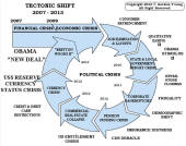
Tipping Points Life Cycle - Explained
Click on image to enlarge
TO TOP
�
TO TOP
