|
JOHN RUBINO'SLATEST BOOK |
||||||||||||||||||||||||||||||||||||||||||||||||||||||||||||||||||||||||||||||||||||||||||||||||||||||||||||||||||||||||||||||||||||||||||||||||||||||||||||||||||||||||||||||||||||||||||||||||||||||||||||||||||||||||||||||||||||||||||||||||||||||||||||||||||||||||||||||||||||||||||||||||||||||||||||||||||||||||||||||||||||||||||||||||||||
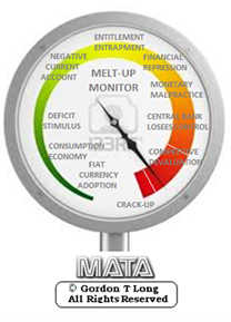
"MELT-UP MONITOR " Meltup Monitor: FLOWS - The Currency Cartel Carry Cycle - 09 Dec 2013 Meltup Monitor: FLOWS - Liquidity, Credit & Debt - 04 Dec 2013 Meltup Monitor: Euro Pressure Going Critical - 28- Nov 2013 Meltup Monitor: A Regression-to-the-Exponential Mean Required - 25 Nov 2013
|
"DOW 20,000 " Lance Roberts Charles Hugh Smith John Rubino Bert Dohman & Ty Andros
|
HELD OVER
Currency Wars
Euro Experiment
Sultans of Swap
Extend & Pretend
Preserve & Protect
Innovation
Showings Below
"Currency Wars "
|
"SULTANS OF SWAP" archives open ACT II ACT III ALSO Sultans of Swap: Fearing the Gearing! Sultans of Swap: BP Potentially More Devistating than Lehman! |
"EURO EXPERIMENT"
archives open EURO EXPERIMENT : ECB's LTRO Won't Stop Collateral Contagion!
EURO EXPERIMENT: |
"INNOVATION"
archives open |
"PRESERVE & PROTE CT"
archives open |

Weekend Mar. 26th , 2016
Follow Our Updates
on TWITTER
https://twitter.com/GordonTLong
AND FOR EVEN MORE TWITTER COVERAGE
![]()
| MARCH | ||||||
| S | M | T | W | T | F | S |
| 1 | 2 | 3 | 4 | 5 | ||
| 6 | 7 | 8 | 9 | 10 | 11 | 12 |
| 13 | 14 | 15 | 16 | 17 | 18 | 19 |
| 20 | 21 | 22 | 23 | 24 | 25 | 26 |
| 27 | 28 | 29 | 30 | 31 | ||
KEY TO TIPPING POINTS |
| 1- Bond Bubble |
| 2 - Risk Reversal |
| 3 - Geo-Political Event |
| 4 - China Hard Landing |
| 5 - Japan Debt Deflation Spiral |
| 6- EU Banking Crisis |
| 7- Sovereign Debt Crisis |
| 8 - Shrinking Revenue Growth Rate |
| 9 - Chronic Unemployment |
| 10 - US Stock Market Valuations |
| 11 - Global Governance Failure |
| 12 - Chronic Global Fiscal ImBalances |
| 13 - Growing Social Unrest |
| 14 - Residential Real Estate - Phase II |
| 15 - Commercial Real Estate |
| 16 - Credit Contraction II |
| 17- State & Local Government |
| 18 - Slowing Retail & Consumer Sales |
| 19 - US Reserve Currency |
| 20 - US Dollar |
| 21 - Financial Crisis Programs Expiration |
| 22 - US Banking Crisis II |
| 23 - China - Japan Regional Conflict |
| 24 - Corruption |
| 25 - Public Sentiment & Confidence |
| 26 - Food Price Pressures |
| 27 - Global Output Gap |
| 28 - Pension - Entitlement Crisis |
| 29 - Central & Eastern Europe |
| 30 - Terrorist Event |
| 31 - Pandemic / Epidemic |
| 32 - Rising Inflation Pressures & Interest Pressures |
| 33 - Resource Shortage |
| 34 - Cyber Attack or Complexity Failure |
| 35 - Corporate Bankruptcies |
| 36 - Iran Nuclear Threat |
| 37- Finance & Insurance Balance Sheet Write-Offs |
| 38- Government Backstop Insurance |
| 39 - Oil Price Pressures |
| 40 - Natural Physical Disaster |
Reading the right books?
No Time?
We have analyzed & included
these in our latest research papers Macro videos!
![]()
OUR MACRO ANALYTIC
CO-HOSTS
John Rubino's Just Released Book
Charles Hugh Smith's Latest Books
Our Macro Watch Partner
Richard Duncan Latest Books
MACRO ANALYTIC
GUESTS
F William Engdahl
OTHERS OF NOTE
Book Review- Five Thumbs Up
for Steve Greenhut's
Plunder!
|
Have your own site? Offer free content to your visitors with TRIGGER$ Public Edition!
Sell TRIGGER$ from your site and grow a monthly recurring income!
Contact [email protected] for more information - (free ad space for participating affiliates).
HOTTEST TIPPING POINTS |
Theme Groupings |
||
We post throughout the day as we do our Investment Research for: LONGWave - UnderTheLens - Macro
|
|||
|
MOST CRITICAL TIPPING POINT ARTICLES TODAY
|
|
||
 |
|||
|
03-26-16 | SII | |
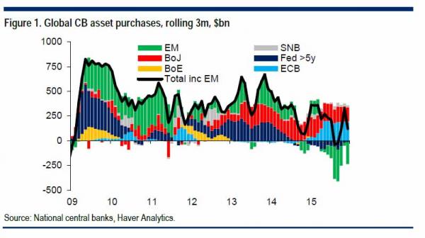
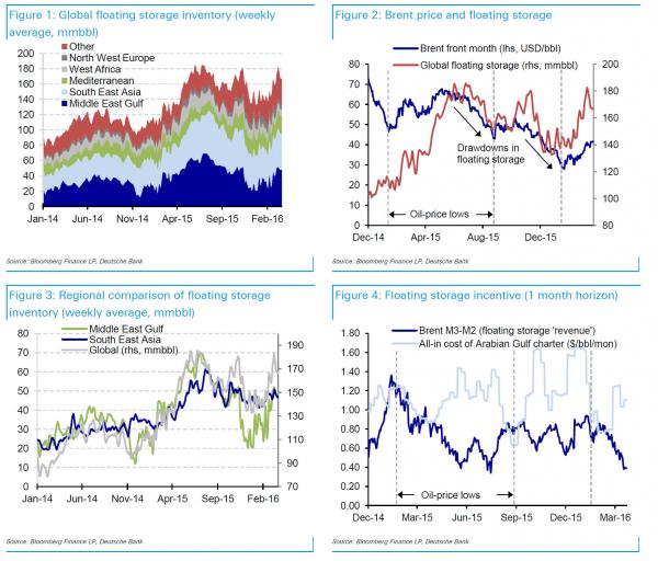
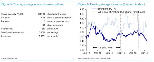
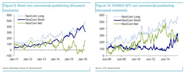
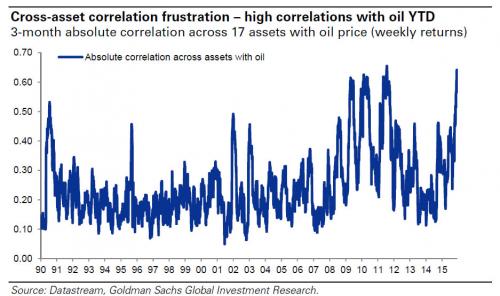
Why Oil Prices Are About To Plunge Again: 31 Million Barrels In Floating Storage Are Coming On ShoreOne week ago, we wrote that as a result of the collapsing crude contango, oil tankers (such as the fully loaded Distya Akula which has been on anchor in the Suez Canal for one month unable to find a buyer for its cargo so it continues to wait) "will soon have to unload their cargo", in the process flooding the already oversupplied market with millions of barrels of crude oil, thus pushing the price of oil far lower. But how many millions of barrels, and how much lower will the price of oil go? For the answer we go to Deutsche Bank's Michael Huseh, who has done the calculations to get the answer. What he finds is that since the start of 2014, global floating storage inventory has ranged between 80 and 180 million barrels (Figure 1). According to estimates of the global VLCC fleet at the end of 2014, the potential storage capacity is implied to be 1169 million barrels. Adding Suezmax vessels would add 528 million barrels of capacity. After touching 186 million barrels in early March, inventories have begun to decline once more. Since the start of 2015, one can identify both periods when builds in floating storage have been associated with rising Brent prices, and also periods when draws in floating storage have been associated with falling Brent prices (Figure 2). Since the Arabian Gulf has represented much of the variability in floating storage inventory, one can also measure the incentives to add or withdraw from storage using Arabian Gulf tanker rates. South East Asia would be another valid candidate to measure economics, as floating storage inventories in that region have moved in a very similar fashion (Figure 3). As we discussed recently, as a result of a recent surge in hedging activity in the front-end of the strip, absent a dramatic collapse in spot prices, the contango is now so low as to make offshore storage no longer economical. Specifically, based on the all-in cost of operating tanker storage (dirty VLCC tanker day rates, financing, transit and transfer loss, insurance and bunkers, Figure 5), the current storage cost is too high relative to the steepness of the Brent forward curve. This means that prices do not justify inventory build, but rather gradual inventory drawdown as existing storage trades are unwound. What is the current prevalent duration of booked offshore storage? A comparison of the historical profitability of storage trades of varying lengths indicates that even at the most extreme instances of contango in the last two years, the Brent forward curve is only steep enough over the first 2 to 6 months to justify the floating storage trade. Comparing the trade economics over a one-month horizon (Figure 4) and over a six-month horizon (Figure 6) shows the relative unattractiveness of the six-month trade. We use the second month Brent contract owing to discontinuities in the pricing of the rolling first month contract. Thus we would expect that floating storage trades begun in late January or early February would be unwound by July or August. As DB calculated, comparing the current level of floating storage (157.3 million barrels) versus that in early February (126.6 million barrels), there may be an additional 31 million barrels of inventory to be drawn down between now and the next inventory trough over the next several months. Depending on the duration of drawdown (three months or six months) this could mean anywhere from 165-330 kb/d of incremental supply. So how, according to DB, should one trade this imminent surge in incremental supply? A tactical short position in Brent may benefit from the contango roll yield which over the first six months of the curve is an annualized 14%. Over the first year of the Brent curve, the roll yield is 11.9% p.a., and to provide an extreme comparison, the roll yield over the first six years of the curve is only 5.3% p.a. In other words, in a flat oil price scenario the contango roll yield for a short position would still provide positive returns if the curve structure remains static. In an upside oil-price scenario, the six-month forward contract should rise slower than the spot price. Long WTI-Brent may be a viable alternative: because positioning in Brent is more clearly extended than NYMEX positioning in WTI, and also because US refineries returning from maintenance may add an incremental 717 kb/d of refinery crude demand between now and June, we believe WTI may be better supported than Brent. Brent net long non commercial positions rose to 164 thousand contracts in the week ending 15March, which is just below the 2015 high of 166 thousand contracts, although still some way below the 2014 high of 195 thousand contracts. In WTI positioning on NYMEX however, net long non commercial positions stand at 331 thousand contracts, only 69% of the record high of 480 thousand contracts in June 2014. Therefore an alternative to selling Brent outright may be a long position on the WTI-Brent spread. * * * Of course, if DB's calculations are correct, and if over the next three months 20% of the total 157 million barrels in offshore inventory are set to come onshore, not only will underlying prices slide, but higher beta assets, such as energy equities but mostly junk bonds due to their record high correlation with energy prices as we showed before... ... the best trade may be to either sell cash bonds or, if one can find them in this illiquid market in which even the ECB is now actively involved in bond purchases, simply buy junk bond CDS. Because between the surge in recent hedging, the collapsing contango, the failure of supply to decline, the failure of demand to increase, there is only one thing the price of crude oil can do: tumble, no matter how many flashing red "OPEC meeting" headlines Bloomberg blasts at idiot headline-scanning algos. |
|||
The Current Oil Price Rally Is Reaching Its LimitsSubmitted by Nick Cunningham via OilPrice.com, Oil prices have climbed by about 50 percent from their February lows, topping $40 per barrel. But the rally could be reaching its limits, at least temporarily, as persistent oversupply and the prospect of new shale production caps any potential price increase. U.S. oil production has steadily lost ground over the past two quarters, with production falling more than a half million barrels per day since hitting a peak at nearly 9.7 million barrels per day (mb/d) in April 2015. American oil companies have gutted their budgets and have put off drilling plans, with many projecting absolute declines in 2016. That has sparked a renewed sense of optimism among oil traders. Moreover, supply outages in places like Iraq and Nigeria have also knocked at least a quarter of a million barrels per day offline, an unexpected disruption that put upward pressure on prices in March. Geopolitical unrest still has the ability to influence prices, even while the world is awash in oil. More oil bulls are piling on in anticipation of the April OPEC meeting, on an unfounded belief that the production freeze may actually have any material impact on global oil supplies. But while oil traders have found some reasons to believe that oil prices are rising, there are just as many, if not more, data points to backup bearish sentiment. Storage levels in the U.S. continue to set records, hitting 523 million barrels for the week ending on March 11. Until inventories start to deplete in a significant way, oil prices will face a lot of resistance trying to break above $40 per barrel. Iran also continues to add production, albeit at a slower-than-expected rate. In fact, the rally to $40 was largely driven by speculation. As short bets peaked and started to unwind, traders closed out positions at a rapid clip, helping to push prices up by $12 to $13 per barrel in less than two months. The trend continued last week as hedge funds and other major money managers increased their net-long positions on crude by another 17 percent. Short positions are now at their lowest levels since last June. But now, with oil traders taking the most bullish positions in months while the fundamentals still have not shifted in a correspondingly significant fashion, traders have set up the conditions where oil prices could snap back to the downside. Once it becomes clear that OPEC won’t come to the rescue, and traders have taken bullish bets to unwarranted levels, prices could fall back to the mid-$30s. It isn’t just a speculator’s game, however. The physical market could change as well with oil prices as high as they are – shale drilling could comeback with oil prices at $40 per barrel and above. Some areas of North Dakota have breakeven prices at around $20 to $25 per barrel. Drilling for oil in shale is already a “short-cycle” event – a well can take weeks or months to be completed, whereas an offshore project can take several years. On top of the quick lead times, U.S. shale companies are also sitting on thousands of drilled but uncompleted wells (DUCs). Over the past year, companies did not want to complete their wells and sell their output into a depressed market and/or they needed to save cash in the short-run so decided to defer well completions. That means a wave of production, the extent of which is unclear, could come back online when oil prices prove enticing enough. Reuters cited a Wood Mackenzie estimate that found that the backlog of DUCs has already begun to decline, falling by about one-third over the past six months. In the Permian Basin and the Eagle Ford, more than 600 wells sit on the sideline awaiting completion, which could lead to the production of an additional 100,000 to 300,000 barrels per day. The backlog of DUCs should be worked through this year and next, returning to normal by the end of 2017. "If the number of DUCs brought online is surprising to the upside, that means U.S. production won't decline as quickly as people expect," Michael Wittner, global head of oil research at Societe Generale, told Reuters. "More output is bearish.” Companies could even be forced to complete more wells in a rush to meet debt payments. Neil Atkinson, head of the oil market division at the International Energy Agency (IEA), largely agrees with the potential shale restart. “If prices keep rising, we could find that because of the cost cutting and the technology improvements that some of this marginal production is switched back on,” he said in a March 18 interview with Fuelfix. “But how long does it take to reassemble crews, get the labor, the equipment and all the rest of it? This is what we don’t know.” Baker Hughes reported that the oil rig count actually turned positive last week, rising by one to 387 (the overall rig count declined by four to hit 476, due to the loss of five natural gas rigs). Obviously, one data point does not prove a trend, but the dramatic declines in rig counts in 2016 have slowed and basically come to a halt in March. It is too early to tell, but drillers could begin to add more rigs if oil prices rise above various breakeven points. That is not good news for oil prices |
|||
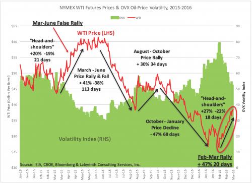
Another False Oil Price Rally: Crossing A BoundaryAuthored by Art Berman Another False Oil Price Rally: Crossing A Boundary The oil-price rally that began in mid-February will almost certainly collapse. It is similar to the false March-June 2015 rally. In both cases, prices increased largely because of sentiment. As in the earlier rally, current storage volumes are too large and demand is too weak to sustain higher prices for long. WTI prices have increased 47% over the past 20 days from $26.21 in mid-February to $38.50 last week (Figure 1). Figure 1. NYMEX WTI futures prices & OVX oil-price volatility, 2015-2016. Source: EIA, CBOE, Bloomberg and Labyrinth Consulting Services, Inc. (click image to enlarge).
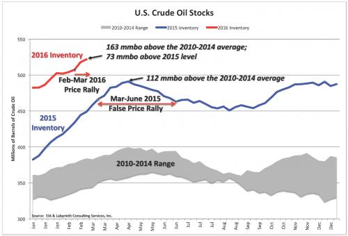
A year ago, WTI rose 41% in 35 days from $43 to almost $61 per barrel. Like today, analysts then believed that a bottom had been reached. Prices stayed around $60 for 37 days before falling to a new bottom of $38 per barrel in late August. Much lower bottoms would be found after that all the way down to almost $26 per barrel at the beginning of the present rally. Higher prices were unsustainable a year ago partly because crude oil inventories were more than 100 mmb (million barrels) above the 5-year average (Figure 2). Current inventory levels are 50 mmb higher than during the false rally of 2015 and are they still increasing. Figure 2. U.S. crude oil stocks. Source: EIA and Labyrinth Consulting Services, Inc. (click image to enlarge).
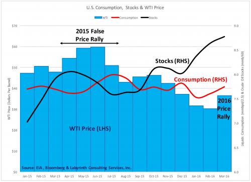
International stocks reflect a similar picture. OECD inventories are at 3.1 billion barrels of liquids, 431 mmb more than the 2010-2014 average and 359 mmb above the 2015 level. Approximately one-third of OECD stocks are U.S. (1.35 billion barrels of liquids). For 2015, U.S. liquids consumption shows a negative correlation with crude oil storage volumes (Figure 3). During the 2015 false price rally, consumption began to increase in April and May following the lowest WTI oil prices since March 2009–response lags cause often by several months. First quarter 2015 prices averaged $47.54 compared to an average price of more than $99 per barrel from November 2010 through September 2014 (44 months). Figure 3. U.S. liquids consumption, crude oil stocks and WTI price. Source: EIA, Bloomberg and Labyrinth Consulting Services, Inc. (click image to enlarge).
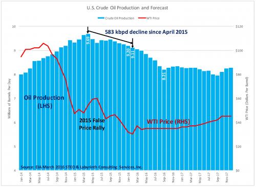
This coincided with the onset of declining U.S. crude oil production after April 2015 (Figure 4). Figure 4. U.S. crude oil production and forecast. Source: EIA March 2016 STEO and Labyrinth Consulting Services, Inc. (click image to enlarge).
Net withdrawals from storage continued until consumption fell in July in response to higher oil prices that climbed to $60 per barrel in June. Production increased because of higher prices from July through November before resuming its decline after prices fell again, this time, far below previous lows. This complex sequence of market responses shows how sensitive the current market is to relatively small changes in price, production and consumption. Most importantly, it suggests that a price variation of only $15 per barrel was enough to depress consumption a year ago. That has profound implications for the present price rally that is now $12 per barrel above its baseline and has already increased by a greater percentage than the 2015 rally. Why Storage Matters Although most analysts pay attention to storage volumes, market balance is generally thought of as a simple balance between supply and demand. But U.S. production is difficult to measure with confidence until several months after-the-fact and the EIA reports crude oil production but not supply. Likewise, EIA reports consumption but not demand. That’s because supply and demand can only be determined by evaluating stock changes and how storage modulates production and consumption. Production plus available storage equals supply. In today’s over-supplied market, consumption plus withdrawals from storage equals demand. Since April, U.S. production has declined 583,000 barrels of crude oil per day. With 163 mmb of crude oil in storage, that net production decline could be eliminated and April levels of production maintained by storage withdrawals for more than 9 months. That is why storage volumes must fall probably into the 2011-2014 range before a meaningful price rally can be maintained. That assumes that demand can tolerate those higher prices. Oil is accumulating in storage because of low demand and low prices. It makes more sense to pay the monthly storage cost (~0.65 per barrel) and sell the oil forward with ongoing futures contracts until the spot price increases and, hopefully, demand also increases. Many people think that the strip of futures contract prices are a reasonable guide to future prices. They are not. Futures prices mostly reflect the supply and demand of futures contracts.(1) That in no way discounts the profound effect that futures trading has on oil prices. The WTI futures market is one of the biggest gambling casinos in the world. Bets are often made on sentiment that in turn is related to world events. Price fluctuations that are based primarily on sentiment, however, have little chance of lasting longer than the sentiment or related events that produced them. Crossing A Boundary The current oil-price rally is based partly on a weaker U.S. dollar but mostly on hope that OPEC and Russia will cut production. For now, that is not even on the table. Rather, a somewhat meaningless production freeze is possible. Some rightfully believe that a dialogue about a production freeze may lead to a production cut some time in the relatively near future. I agree with that but it is a rather empty reason for oil prices to increase by almost 50%. Traders are “following the tape,” meaning they have covered previous short bets and are following the momentum testing increasingly higher price thresholds as long as someone is willing to take the other side of the bet. That’s the way the market works. It would not surprise me if this price rally lasts awhile like the 2015 rally. I am interested in the requisite conditions that would allow a meaningful and sustainable price rebound. Early in the 2014 oil-price collapse, I thought it was a relatively straight-forward matter of reducing production so that the market could balance. As low prices persisted, I recognized that a boundary had been crossed and that somehow, the principles that seemed to govern oil markets before September 2014 no longer applied in the same ways. I now believe that the world economy has been substantially weakened and injured by debt following the 2008 Financial Collapse and the easy-credit monetary policies that followed. At some time in the not-too-distant future, the relentless depletion of legacy production and underinvestment in current exploration and production will result in much higher oil prices. The global economy will have to be much stronger to adjust to that. The investigation I have presented here about the possible similarities between the present increase in oil prices and the false price rally of March-June 2015 reinforces my sense that a return to higher oil prices is not at all straight-forward. Oil markets are a leading indicator for the broader economy because the economy runs mostly on energy and not so much on money. (2) It seems that price and demand may be range-limited. Small changes in demand move prices up and down until those price changes feed back to changes in demand. Production has been like a machine working tirelessly in the background as easy money has kept it moving regardless of low prices and the absence of profit. That is how distorted the market has become. World production now appears to be falling and that is certainly a necessary step in the right direction toward market balance. I anticipate an OPEC plus Russia production cut in 2016 and that will unquestionably move the market to some kind of balance. I suspect, however, that the new balance may be one in which prices and demand both remain lower than on the other side of the price-collapse boundary that was crossed in 2014. (1) J.M. Bodell (personal communication). Mike has taught me most of what I know about storage and comparative inventories. |
|||
TIPPING POINTS, STUDIES, THESIS, THEMES & SII COVERAGE THIS WEEK PREVIOUSLY POSTED - (BELOW) |
|||
| MOST CRITICAL TIPPING POINT ARTICLES THIS WEEK - Mar 20th, 2016 to Mar 26th, 2016 | |||
| TIPPING POINTS - This Week - Normally a Tuesday Focus | |||
| BOND BUBBLE | 1 | ||
| RISK REVERSAL - WOULD BE MARKED BY: Slowing Momentum, Weakening Earnings, Falling Estimates | 2 | ||
| RISK REVERSAL - WOULD BE MARKED BY: Slowing Momentum, Weakening Earnings, Falling Estimates | 03-22-16 | 2 | |
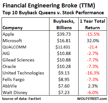
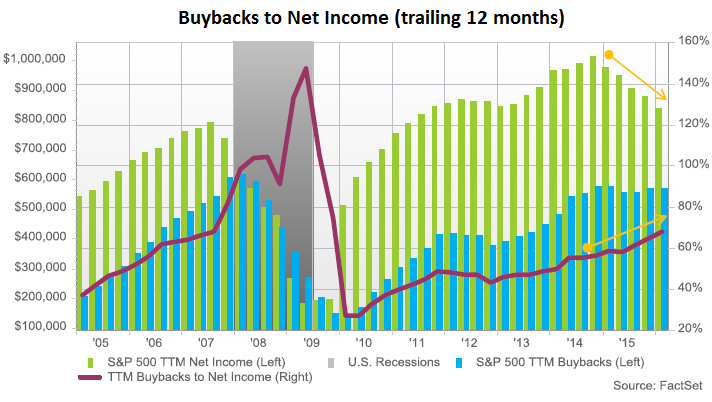
Share Buybacks Turn ToxicBy Wolf Richter, WOLF STREET Companies are still borrowing and spending billions on buying back their own shares – one of the big drivers behind the blistering stock market rally of the past few years. It worked wonderfully and without fail. But suddenly, it’s doing the opposite, and now the shares of the biggest buyback queens are getting hammered. Something broke in the gears of this financially engineered market! During the November-January period, 378 of the S&P 500 companies bought back their own shares, according to FactSet. Total buybacks in the quarter rose 5.2% from a year ago, to $136.6 billion. Over the trailing 12 months (TTM), buybacks totaled $568.9 billion. That’s an enormous amount of corporate cash that was dumped on the market! The sector that blew – “blew” because that’s how it turned out – the most money on this type of financial engineering project was Information Technology, with $33.2 billion in buybacks last quarter. Four of the top 10 buyback queens were Information Technology: Apple, Microsoft, Oracle, and Visa. Apple alone blew $6 billion in the quarter, even as its stock was tanking. Relative to its average share price over the period, it paid a 13% premium, the second highest premium paid by S&P 500 companies, after Symantec! Over the trailing 12 months, Apple blew nearly $40 billion on buybacks, and yet its stock dropped 15.5%. This table shows the top 10 buyback queens in order of the amount spent on a TTM basis, and the mostly dismal performance of their shares over the same period.
GE didn’t quite make this list (though it bought back $3.1 billion in Q4), but it was very active in different ways, following through on its $50-billion buyback program announced in April last year. FactSet:
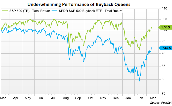
Total buybacks are ballooning in proportion to net income, which declined over the TTM period for the first time since 2009. So buybacks as a percent of income rose from 64.9% a year ago to 68.1% at the end of the quarter. In terms of free cash flow after dividends, share buybacks have now ballooned to 101.7%. This was, as FactSet put it, “a huge jump from the year ago quarter when the ratio was 81.6%.” The culprit? With income down over the TTM period, aggregate free cash flow has dropped 9.5% year-over-year. FactSet’s chart shows the declining net income (green bars), the nearly flat share-buybacks (blue bars), and the rising buyback-to-income ratio (red line, right scale). Note what happened last time income began to decline (2007) and share buybacks followed in 2008: the stock market crashed. And yet, despite the current heroic efforts to prop up their shares, companies have seen their shares get hammered. As FactSet’s chart below shows, over the past 12 months, the S&P 500 total return index, which included dividends, rose 1.3% (green line). But the total return of SPDR S&P 500 Buyback ETF, which tracks the 100 companies in the S&P 500 with the highest buyback ratio, dropped 7.6% (blue line): Clearly, financial engineering is kaput! Buybacks no longer function reliably in inflating stock prices. The opposite seems to be happening. Perhaps investors are finally starting to see through these shenanigans, and perhaps they’re now beginning to fret about all the debt these companies take on in order to fund buybacks! When companies borrow billions to then blow that moolah on buying their own shares that then promptly decline in value, it doesn’t create a loss on the income statement. Instead, those billions quietly go up in smoke. What’s left behind? Fewer shares outstanding, piles of additional debt, mauled cash balances, and much higher financial risk. But once companies see that share buybacks are becoming toxic as their shares decline despite buybacks, they curtail them. And last time this happened – in 2008 – it pulled the rug out from under the already teetering markets. The bull market from early 2009 into May 2015 looks just like every bubble in history, and there’s one sign after the next that we did indeed peak last May. The dominant pattern in the stock market is the “rounded top” pattern. Read… This Chart Shows the First Big Crash Is Likely Just Ahead |
|||
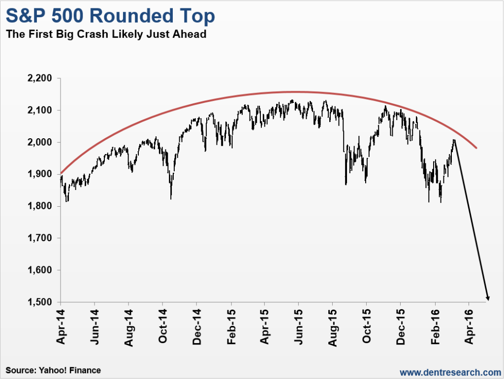
This Chart Shows the First Big Crash Is Likely Just AheadBy Harry Dent, author of the new book, How to Survive (and Thrive) During the Great Gold Bust Ahead:The story on Wall Street and CNBC continues to be that we’re in a correction and this is a buying opportunity. Even Warren Buffett joins the chorus of stock market cheerleaders for the skeptical public. Well, I agree with the skeptical public, not the experts here! The bull market from early 2009 into May 2015 looks just like every bubble in history, and I’m getting one sign after the next that we did indeed peak last May. The dominant pattern in the stock market is the “rounded top” pattern:
After trading in a steep, bubble-like channel from late 2011 into late 2014, with only 10% maximum volatility top to bottom, the market finally lost its momentum… just as the Fed finished tapering its QE. That’s because the Fed was the primary driver in this stock bubble in the first place! But the first sign that the bubble had indeed peaked was the break of that upward channel last August. Surprise, surprise! Without the Fed’s stimulus, stocks started to sputter out! With that sign we can point to what now looks like a series of major tops, in one major index after the next, since late 2014:
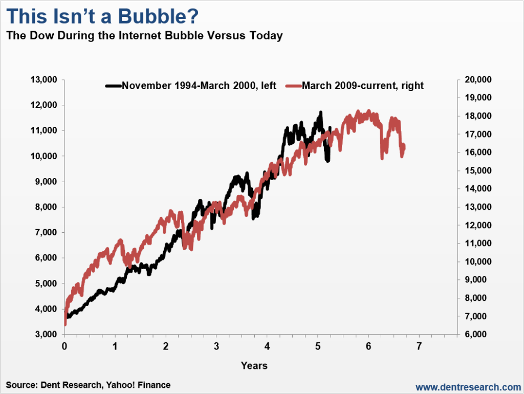
The Shanghai Index crashed 45% in 2.5 months, similar to the Dow in late 1929 on its first 2.5-month wave down. That one was so obvious that when I said it was about to burst, it peaked that day and rolled over the next! Then there’s the Biotech bubble that crashed 40% into its February 11 bottom, another one that’s clearly done for. And major global banks are crashing, with even Deutsche Bank in Germany down 59% from its 2015 highs… and 89% from its 2008 highs. You don’t even want to look at the larger banks in Italy! But one analyst after the next still doesn’t think it’s a bubble! So I pull out the next chart, comparing this bubble with the obvious bubble in stocks from late 1994 into early 2000 – the infamous tech bubble.
Again, this looks like every major bubble in history! As I told Grant Williams in an interview for Real Vision, this bubble along with every other follows the same pattern – there’s a rise, a climax, and a sharp fall! From the moment we’re born until we kick the bucket, humans are cyclical along with everything they do. That’s the other thing Grant and I talked about: what’s consistent across humans is that we absolutely refuse to recognize a bubble when we see it. That’s why they call it “living in a bubble!” I told Grant that someone once handed one of my books to Bill Clinton, and I told the guy, “you’re wasting your time!” Economists are bad at seeing bubbles, but politicians are even worse! If the economy does well, they want to take credit for it. If it doesn’t, it’s probably the last party’s fault! They attribute everything to government and give consumers a back seat. It’s laughable! The markets on crack are still in denial about the bubble and its ultimate collapse. The typical stock bubble crashes between 70% to 90%. In other words, they don’t correct… they don’t have a soft landing… they BURST. No exceptions in history. In the rounded top scenario above, we’re getting close to the point where the markets are very likely to fail for the second time to make a new high since the peak in mid-May. When that happens and the S&P 500 falls to new lows below the 1,810 threshold, reality might finally kick in. The markets will then see a more serious wave down, likely into around early July or so. And eventually, it’ll carry the Dow to around 5,500 to 6,000 likely by late 2017. The greatest crash of your life is just ahead… By Harry Dent, author of the new book, How to Survive (and Thrive) During the Great Gold Bust Ahead, where he warns investors that moving their assets into gold isn’t the safe haven they think it is – and why it won’t protect them from the biggest market collapse since The Great Depression. Get a free copy of his eBook here. |
|||
| GEO-POLITICAL EVENT | 3 | ||
| CHINA BUBBLE | 4 | ||
| JAPAN - DEBT DEFLATION | 5 | ||
EU BANKING CRISIS |
6 |
||
| TO TOP | |||
| MACRO News Items of Importance - This Week | |||
GLOBAL MACRO REPORTS & ANALYSIS |
|||
US ECONOMIC REPORTS & ANALYSIS |
|||
| CENTRAL BANKING MONETARY POLICIES, ACTIONS & ACTIVITIES | |||
| Market - WEDNESDAY STUDIES | |||
| STUDIES - MACRO pdf | |||
TECHNICALS & MARKET |
|
||
TECHNICALS & MARKET |
03-23-16 |
||
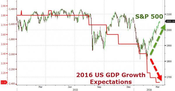
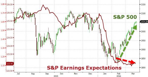
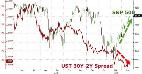
Macro-Economy Earnings Expectations The Bond Market
|
|||
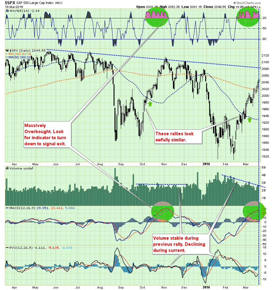
Only 4% From Record Highs?Submitted by Lance Roberts via RealInvestmentAdvice.com, In this past weekend’s newsletter, I stated
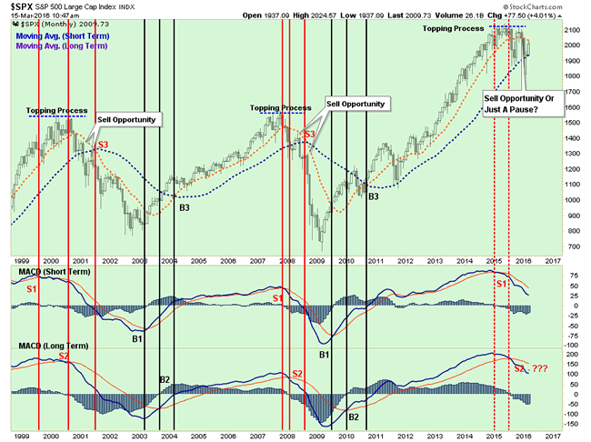
While I have maintained a cautious stance in portfolio allocations since May of last year, I have reiterated many times that interventions by Central Banks could change the shorter-term dynamic of the markets from bearish back to bullish. These past few weeks have seen exactly that occur. The question that we must primarily answer is whether enough “technical repair” has been completed to warrant an increase in equity exposure in portfolios. As stated above, the “risk” that the current “bear market” rally is nearer completion outweighs the possibility currently the markets are changing back to a “bull market.” Therefore, it is more prudent, for long-term investors, to remain cautious for now. Only 4% From All-Time HighsYesterday, while I was at the gym I looked up to see a “talking head” on CNBC stating the markets are only 4% off of their all-time highs. He was making the case, of course, that the “bull market was back” and the recent sell-off was a “buy the dip” opportunity. But is that really the case? Of course, we will never know for certain until we have the clarity of hindsight. However, since we can’t invest with hindsight we must make some assumptions, or should I say “guesses” about what will happen in the weeks and months ahead. He is correct. The markets are just off of their all-time closing highs as of yesterday’s close as shown below. However, this is only part of the story as the current action in the market is still reminiscent of “broadening market tops” we have witnessed in the past. A quick review of 2000 and 2007 show some important similarities to the current market environment. In 2000, as the market began its long and drawn out topping process, the market plunged by 11.2% in early 2000.The market then rallied back to within just 0.5% of setting new all-time highs before the “dot.com”crash set in. We can see the same “topping process” again in 2007. In August of that year, the market dropped almost 8% and then subsequently rallied to a new “all-time high” leading the bulls to chastise the “bears” for missing out on a “buy-the-dip” opportunity. The market then dove again, another 7.8% decline, followed by a new rally to within just 4% of all-time highs. The airwaves were filled with chatter the “bull market” remained intact as “green shoots” and a “Goldilocks economy” were evident. Nothing was further from the truth. Let’s look at the current market environment once again. As shown above, the current market environment remains very similar to those previous market topping processes. The 8.7% in late summer rallied back to being just shy of setting all-time highs. The “bulls” were lured back into calming waters just as the next wave crashed upon them sending markets down 11.3% to closing lows. Yes…the markets are once again just 3.7% off of their closing highs. The rally from the lows has been extremely sharp and has once again lured the “bulls” back into the water. Could this be when the markets break out to new “all-time” highs and re-establish the underlying bullish trend? Possibly. Or, could this be another rally within an ongoing topping process that leads to sharper losses in the future? The Long-ViewWhile the technical backdrop has indeed improved in the short-term, the longer-term picture still remains worrisome. As shown below, two of the three major monthly sell signals have been triggered. The last will be the crossover of the short-term and long-term monthly averages. As discussed previously, due to the length of time involved in monthly moving averages, by the time this signal crosses the bear market will already be in full swing. However, what is important to note is that all the signs of previous market action during a major market topping process are present.
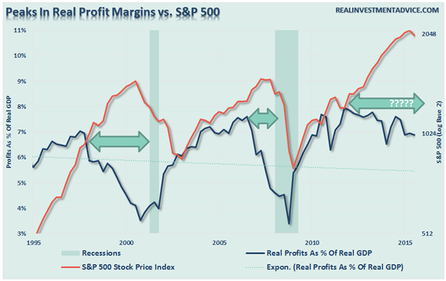
However, as we approach summer, the seasonal weakness of the markets will likely resurface as the reality of Central Bank interventions are digested and focus once again returns to the real driver of asset prices longer term – profits. As shown below, that is also another picture more reminiscent of past problems for the “bulls.”
We will not know for certain until well into the future when either the “bulls” or “bears” can claim victory. Unfortunately, we don’t have the ability to invest with hindsight.
|
|||
| COMMODITY CORNER - AGRI-COMPLEX | |||
| THESIS - Mondays Posts on Financial Repression & Posts on Thursday as Key Updates Occur | |||
|
2016 | THESIS 2016 |  |
| 2015 - FIDUCIARY FAILURE | 2015 | THESIS 2015 |  |
| 2014 - GLOBALIZATION TRAP | 2014 |  |
|
|
2013 2014 |
|||
Ty Andros: “ITS A CURRENCY & FINANCIAL EXTINCTION EVENT!”The Financial Repression Authority is pleasured to be revisited by Ty Andros, Chief Investment Officer of the Sanctuary Fund. FRA Co-Founder Gordon T. Long has has a stirring conversation with Mr. Andros on a number of current economic developments and consequently, the things to unfold. Ty began his commodity career in the early 1980’s and became a managed futures specialist beginning in 1985. Mr. Andros duties include marketing, sales, and portfolio selection and monitoring, customer relations and all aspects required in building a successful managed futures and alternative investment brokerage service. Mr. Andros attended the University of San Diego, and the University of Miami, majoring in Marketing, Economics and Business Administration. He began his career as a broker in 1983, and has worked his way to the creation of TraderView of which he is the CEO. Mr. Andros is active in Economic analysis and brings this information and analysis to his clients on a regular basis. Ty prides himself on his personal preparation for the markets as they unfold. Ty is an expert in applying the indirect exchange method as a principle of the Austrian School of Economics in his investing approach. THE AUSTRIAN SCHOOL OF ECONOMICS It consists of 3 major components.
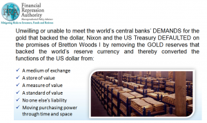
The cycle we are going through now has happened hundreds of times in history and has led to the rise and falls of empires. It’s because of people forgetting the past and repeating the same mistakes. If you don’t have sound money, you really don’t have protection against the government. They can confiscate your money and they have been doing so since Bretton Woods. “The money that we hold in banks is a worthless junk bond. The government has essentially become the mafia; they are scheming and transferring property to themselves.” SOUND MONEY The figure below outlines the specific functions of money: If it doesn’t have these components then you’re not holding money. Until 1971 it had all those features, and it has been replaced with an I.O.U of fiscally and morally bankrupt politicians and banks. It is worth no more than the paper it is printed on. “In my opinion, the gold and silver bear market is over so it is a prime time to start accumulating now.” MARKET CAPITALISM AND WEALTH CREATION Capitalism is about getting more for less and three groups of people being rewarded for it: The consumer because he is able to give his family a better life, the company which supplied it, and the employees within the company. Socialism eats everything. Real wealth and income creation are in freefall. There will be no recovering. The confiscation of wealth is also known as runaway regulations, runaway debt creation, more taxes and currency debasement. “Its pure confiscation, cannibalism, and slavery. It is eating the golden goose. It’s the people that aren’t self-reliant and don’t produce anything eating those that do.” It’s pure confiscation, cannibalism, and slavery. It is eating the golden goose. It’s the people that aren’t self-reliant and don’t produce anything eating those that do. Nobody owns their homes, it’s simply a record that’s held in a database and all they have to do is misplace it. Nobody owns their stocks in their name and if you look at your banking agreement you don’t even have title to your money, the bank does. Slowly but surely they have removed everything. They don’t let you hold money because they can’t steal from it; real money has been outlawed. “Gold is the currency of kings, silver is the currency of merchants, and debt is the currency of slaves.” CURRENCY EXTINCTION EVENT GDP is nothing of the sort, it’s just debt disguised as GDP. It is spending future wealth rather than creating future wealth for proper allocation to productive enterprises. “We have nothing; we are just a bunch of debt slaves living in an illusion until we wake up.” THE EVENTS OF 1971 President Nixon changed from a reserve backed system where the dollar was semi redeemable in gold and silver to a system that has no backing. “It was the greatest heist in history. It was the greatest transfer of wealth from the public to the ‘bankseters’.” He did this so that he wouldn’t have to operate in a prudent manner. Prudent manner means have to pass laws and have taxes which gives people a reason to get up in the morning and have the ability to do the capitalism which was discussed earlier. When you have bad laws and bad regulations, the economy will either collapse or they have to print the money to fill the whole; unfortunately they chose the latter.
“History has shown what happens to people who try to fix this system.” Kennedy was taking the central bank back and creating silver backed money, 90 days later he was dead. Of course we will never truly know, everything is so covered up now and the government is incapable of telling the truth. THE INDIRECT EXCHANGE “This is how you go through a currency and financial extinction event. Exchange something of uncertain value, fiat money, for something of certain value, real wealth. This is the indirect exchange in simplest terms.” So much of the ‘financialization’ of the economy is an illusion because it is not the real things going up; it’s the paper that they’re priced in losing its purchasing power “The greatest applied Austrian economist in the world is none other than Warren Buffet. “ What Warren does is he sells paper which means liabilities are being debased by central bank’s printing presses and credit creation. If he writes an insurance policy for someone for $10 million, he now has a liability of 10 million, if he did this in 2000 that liability may be 5 million and simultaneously he took that money and bought the Burlington Northern Railroad, which is something that will just reprice to reflect the lower purchasing power it is denominated in. If we are in a depression or a boom, regardless the railroads will run. Half of his great track record is inflation that isn’t properly disclosed. He has been doing this since, coincidently 1971. He has been selling paper and buying real things with cash flow ever since. Gold doesn’t cash flow but it is about to. Because of negative interest rates you’re paying somebody to borrow money from you. If you are able to hold your money without having to pay someone to hold it.The gold and silver bear market is over. As these destructive negative interest rates go deeper and deeper, people will eventually wake up. They’ve already woken up, this is what’s going on with the presidential race and particularly Donald Trump. “This is the greatest insanity ever. It will be studied and written about for centuries. It is a much bigger example of stupidity and failing to learn the lessons of history. It is much larger in scale than the Great Depression because of the nature of globalization and the nature of man.” Abstract written by, Karan Singh [email protected] Video Editor: Sarah Tung [email protected]
|
|||
2011 2012 2013 2014 |
|||
| THEMES - Normally a Thursday "Themes" Post & a Friday "Flows" Post | |||
I - POLITICAL |
|||
CENTRAL PLANNING - SHIFTING ECONOMIC POWER - STATISM
MACRO MAP - EVOLVING ERA OF CENTRAL PLANNING
|
G | THEME | |
| - - CRISIS OF TRUST - Era of Uncertainty | G | THEME | |
CORRUPTION & MALFEASANCE - MORAL DECAY - DESPERATION - RESENTMENT. |
US | THEME PAGE |  |
| - - SECURITY-SURVEILLANCE COMPLEX - STATISM | G | THEME | |
| - - CATALYSTS - FEAR (POLITICALLY) & GREED (FINANCIALLY) | G | THEME | |
II-ECONOMIC |
|||
| GLOBAL RISK | |||
| - GLOBAL FINANCIAL IMBALANCE - FRAGILITY, COMPLEXITY & INSTABILITY | G | THEME | |
| - - SOCIAL UNREST - INEQUALITY & A BROKEN SOCIAL CONTRACT | US | THEME | |
| - - ECHO BOOM - PERIPHERAL PROBLEM | M | THEME | |
| - -GLOBAL GROWTH & JOBS CRISIS | |||
| - - - PRODUCTIVITY PARADOX - NATURE OF WORK | THEME | MA w/ CHS |
|
| 01-08-16 | THEME | MA w/ CHS |
|
| - - - STANDARD OF LIVING - EMPLOYMENT CRISIS, SUB-PRIME ECONOMY | US | THEME | MA w/ CHS |
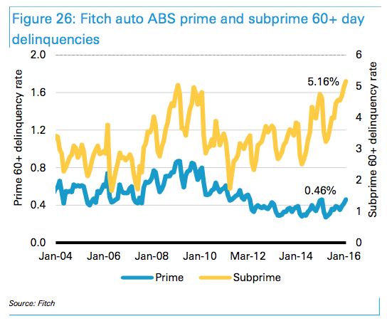
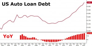
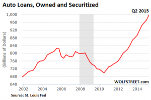
This Could Be A Problem: Losses On "Deep" Subprime Auto Double Industry AverageOn Saturday, we highlighted a rather disturbing statistic. 60+ day delinquencies for subprime auto ABS have now risen above crisis levels to 5.16% - levels we haven't seen since 1996.
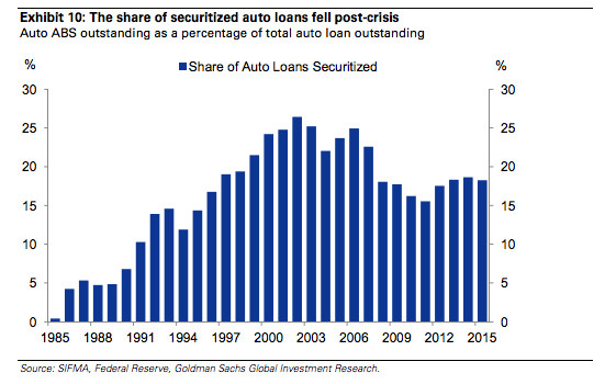
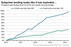
That won’t surprise regular readers. The writing has been on the wall for quite a while. More auto loan originations are going to borrowers with shoddy credit and loan terms are looking more and more stretched by the quarter. Just ask the NY Fed. Or Experian, where even permabull Melinda Zabritski will tell you that underwriting standards are getting looser (although she likely won’t say that’s a bad thing). While Citi and others are quick to point out that the originate to sell model isn’t prevalent in the auto loan industry, the inability for lenders to securitize subprime loans may well put the brakes on US auto sales. After all, the pool of creditworthy borrowers is finite. That means that at a certain point, incremental sales must be engineered by making ineligible borrowers eligible by resorting to looser underwriting. But that only works if you can offload that credit risk. No lender wants to be sitting on a book full of used car loans to deep subprime borrowers with sub-600 FICOs, and so, if demand for subprime auto ABS dries up, so too will credit to the subset of borrowers who are driving (no pun intended) incremental sales growth. Here’s a look at the share of total auto loans that have been securitized:
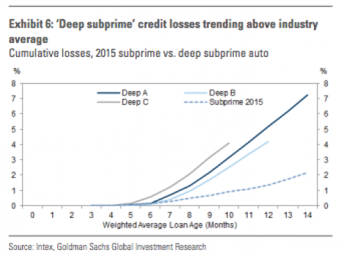
As you can see, and as we noted last week, the share has remained range-bound for at least 15 years. But again, the question is what happens to auto sales if lenders can no longer expand the pool of eligible borrowers by relaxing their standards? That would likely occur if subprime and deep suprime start to underperform, leading investors to pull back from paper backed by loans to less creditworthy borrowers. And guess what? Deep subprime is underperforming. Massively. Here's Goldman:
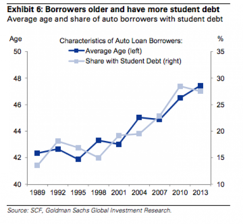
Remember, somebody owns this paper and they sure as hell won't be buying into any more deep subprime deals if the collateral pools continue to perform like that. And if investors aren't buying, then lenders can't offload their credit risk which in turn means they will simply stop lending to shoddy borrowers. Once that happens, you can kiss the US auto sales "miracle" goodbye - for good. If you need proof of just how important the ability to securitize truly is for subprime auto lenders, simply review the first-hand account we published last week that details what's happening "under the industry's hood," so to speak. For now, we'll close with one last chart from Goldman which shows what happens when a pair of trillion dollar bubbles collide head-on with Americans' inability to free themselves from the shackles of debt:
|
|||
Another Bubble On The Verge Of PoppingSubmitted by Eric Peters via EricPetersAutos.com, Termites start low and work their way up. By the time you notice them, it’s often already too late to save the place. All you can do is rebuild, start over. This analogy may be useful in terms of understanding what’s going on in the car business… on the lower end of that business. And what that could portend for the rest of the business – ostensibly “doing gangbusters,” according to mainstream media accounts. You know … like the housing market was “doing gangbusters” a few years back. Until, of course, it wasn’t. Well, check this: The number of “subprime” car loans being sold is increasing – and so is the number of delinquencieson those loans. They are up to 5.16 percent, the highest level in 20 years. Consider what this means. First, a growing number of people cannot get traditional loans for new cars. They lack the verifiable income to qualify – or their credit scores suck. But financial flimflam outfits are loaning them money – often, at exorbitant interest – nonetheless. Sound familiar? It does to Comptroller of the Currency Thomas Curry, who recently said “… what’s happening in the auto loan market reminds me of what happened in mortgage-backed securities in the run-up to the (housing) crisis.” Second – and not surprisingly – these loans are being defaulted on in growing numbers. Apparently, people who can’t swing a mainline loan at 3 or 4 percent interest are having trouble keeping up with loans that have interest rates twice as high. Who’d a thunk it? Now, are talking about $25 billion in subprime auto loans. Will Uncle step in – once again – and bail out the shysters issuing these loans with more of our money? Of course he will. Spending other people’s money is not only what Uncle does best – it’s all that Uncle does. He hasn’t got a penny of money that’s not been taken from others first. Why not be generous? There’s always more where that came from. But this rant is not primarily about Uncle and his bottomless generosity with other people’s money. It’s about what the bubbling trouble in the subprime auto loan mark says – canary in the coal mine-wise – about the health of the car industry generally. Consider: If – as the numbers suggest – more and more people are having trouble getting conventional car loans, either they are uncreditworthy or cars are too expensive for them (relative to income). This latter thing is the canary in the coal mine. A few weeks ago, I wrote about the average price paid for a new car last year – about $32,000 – a record high. And about the corollary to this: The ever-increasing duration of new cars loans. They are now on average six years long – and seven year loans are becoming pretty common. In order to spread out payments (now averaging almost $500 a month) that have become simply too much to manage for most people. All these things are canaries in the coal mine. And the canary’s looking woozy. Even a slight upticking of interest rates will send him toppling off his perch, to land lifeless on the newspaper below. The private banking cartel that manipulates the American economy for its benefit – you know, the “Federal” (like “Federal” Express) Reserve – has been threatening to raise the cost of money (interest) for some time now. The only thing holding it back has been flaccid spending, a general reluctance on the part of the public to buy stuff with money they haven’t got. Which includes cars. There was a time – within living memory – when you didn’t have to hock yourself to a six or seven year loan to be able to drive home a new car car. Many people paid cash. Today, almost 90 percent of all new car “sales” are financed. And more than 55 percent of used car “sales” are financed, too. The Fed has been attempting to “stimulate” (false) demand by tempting people with low-cost money (i.e., low interest rates) and that is probably the main thing propping up demand for new cars – much in the same way that artificial demand for homes was confected by the very same Fed. Especially given that Uncle succeeded in executing a kind of mechanical genocide of good (and affordable) used cars via the odious “cash for clunkers” program several years back. There are not many serviceable used cars available as a result – and the ones that are cost a pretty penny. Hence the need to finance them. But the high cost of used cars plus low-cost (even “free”) money in the form of interest-free (or interest so low it pretty much tracks with inflation) loans on new cars makes it very tempting to sign up for a new car loan… even one that’s six or seven years long (about the same time as the typical indenture contract during the early colonial era, if you’re interested in a historical parallel). But when, inevitably, the cost of money goes up – as it must if the private banking cartel is going to resume its profiteering – it will have the same effect on the car business as the same thing had on the housing /real-estate business. Better grab hold of something. The spreading evidence of a new round of subprime rot is just the beginning. And it won’t be confined to just this one thing, either.
|
|||
III-FINANCIAL |
|||
|
FLOWS - Capital, Liqudity & Credit Flows
|
MATA RISK ON-OFF |
THEME | |
| CRACKUP BOOM - ASSET BUBBLE | 12-31-15 | THEME | |
| SHADOW BANKING - LIQUIDITY / CREDIT ENGINE | M | THEME | |
| GENERAL INTEREST |
|
||
|
|||
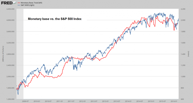
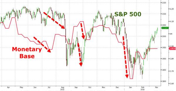
Month-End Market Weakness Looms As Monetary Base Trumps BuybacksSubmitted by Pater Tenebrarum via Acting-Man.com, A Useful Leading Indicator?We often see charts comparing the S&P 500 to the growth in the Federal Reserve’s balance sheet, or more specifically, to assets held by the Fed. There is undeniably a close correlation between the two, but it has struck us as not very useful as a “timing device”, or an early warning device if you will. Recently we have come across a video of a presentation by Bob Murphy, in which he uses a slightly different comparison that might prove more useful in this respect. Instead of merely looking at Fed assets, he uses the total monetary base. Here is a chart comparing the monetary base to the S&P 500 Index since 2009:
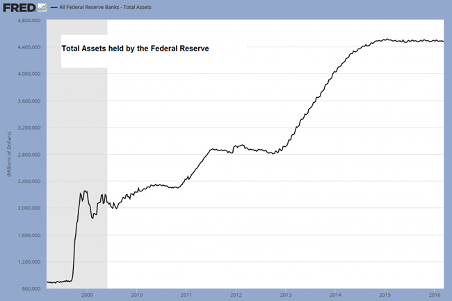
The monetary base (red line) vs. the S&P 500 (blue line) – as can be seen, sometimes one or the other series leads, but in recent years the monetary base has been a leading indicator. It probably lagged the market in 2010/11 due to the fact that traders at the time bought stocks in anticipation of more monetary pumping – whereas nowadays the market appears to be reacting with a slight lag to changes in base money. Below is a chart that shows consolidated assets held by the Federal Reserve system for comparison. Since the Fed is currently reinvesting funds from MBS and treasuries that mature, its total asset base is basically flat-lining since the end of QE3. Obviously, all that can be gleaned from this fact is that the central bank is currently not actively pumping up the money supply. Currently money supply growth is therefore largely the result of commercial bank credit growth.
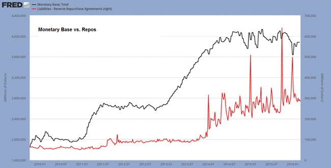
Assets held by the Federal Reserve – flat-lining since the end of QE3. Interesting, but not useful as a short term leading indicator of the stock market – click to enlarge. A Different RegimeThe post 2008 monetary regime differs from the previous state of affairs due to the vast growth in central bank balance sheets and the associated growth in bank reserves. This has created a technical problem for central banks if they want to tighten monetary policy, as the Fed is planning to do. In times past the Fed would either add or withdraw liquidity from the system by means of asset purchases, resp. sales, both of the temporary and occasionally the permanent variety (i.e., via repos and coupon passes), so as to keep the effective Fed Funds rate on target. It can no longer do this if it wants to keep the stock of assets it holds unchanged. Since selling off enough assets to return to the previous regime would collapse the money supply, it isn’t going to happen. The Fed is primarily keeping control over the FF rate target by paying interest on bank reserves. This keeps the currently almost non-existent interbank lending market in catatonia, since there is no point in lending out excess reserves for less than one can get safely from the Fed. However, ever larger short term reverse repo operations are undertaken as well (we have previously discussed the vast surge in these transactions at year-end). These reverse repos usually swell near month-end and especially near the end of a quarter. This seems to serve various purposes. Among these is apparently the desire to relieve collateral shortages/ delivery fails (which have increased due to QE removing a great many securities from the marketplace), but the Fed is presumably also employing these reverse repos as another way of exerting control over short term interest rates. While the amount of assets held by the Fed doesn’t change on account of such operations (since the assets are only lent out, but continue to belong to the Fed), it seems the effect is reflected in monetary base statistics. This is illustrated by the chart below, which compares outstanding reverse repos to the monetary base. Spikes in reverse repos align quite closely with short term declines in the monetary base, even if the correlation is not perfect (as these are not the only factors influencing the base).
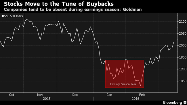
The monetary base vs. Fed reverse repos outstanding. Demand for Stocks Declines Around Quarter-EndOne thing is clear: during the brief time periods when large reverse repo operations are undertaken, liquidity in the system temporarily decreases. The lead-lag relationship between the monetary base and the S&P 500 shown in the first chart seems to suggest that this does have an impact on the stock market. How big an influence it really represents is however not certain, as there is another important reason why the demand for stocks tends to decline around the end of the quarter. As has recently been discussed at Bloomberg, earnings season begins at the time as well, which forces companies to suspend stock buybacks for a few weeks. Given the enormous size of buybacks in recent years (another new record high will likely be achieved this quarter), it is probably no surprise that the period during which buybacks are suspended also aligns closely with market weakness of late. Here is a chart derived from a Goldman Sachs research report illustrating this point:
Stocks have been especially weak last quarter around the peak of the earnings season. According to GS analyst David Kostin, the influence of the “blackout period” is especially large at the moment, as other important groups of potential buyers are currently out of the picture:
We’re not so sure that corporate buybacks are the “sole demand for equities”, but it is probably true that buybacks or the lack thereof have more effect on short term volatility in times when other market participants are uncertain and less inclined to buy. ConclusionRegardless of which source ultimately proves more important, the above suggests that market liquidity tends to become more scarce around the end of the quarter at present. We have already seen this effect play out twice in row and it could well be that there will be another replay this quarter. Considering what happened in 2010, much also depends on perceptions about upcoming Fed policy, but it seems unlikely that yesterday’s FOMC statement will do much to alter expectations. We can take the buyback blackout period as a given, which leaves us with watching the monetary base for clues. It will be interesting to see whether the next decline in the monetary base – which should be expected to occur around quarter-end based on previous observations – will once again precipitate stock market weakness. It is definitely possible that this indicator is useful for short term trading purposes – at least for the time being. Stay tuned for a more general look at developments in the US monetary backdrop to be posted shortly. |
|||
| STRATEGIC INVESTMENT INSIGHTS - Weekend Coverage | |||
 |
|||
|
SII | ||
|
SII | ||
|
SII | ||
|
SII | ||
| TO TOP | |||
Read More - OUR RESEARCH - Articles Below
Tipping Points Life Cycle - Explained
Click on image to enlarge
TO TOP
�
TO TOP
























![I believe that banking institutions are more dangerous to our liberties than standing armies. If the American people ever allow private banks to control the issue of their currency, first by inflation, then by deflation, the banks and corporations that will grow up around [the banks] will deprive the people of all property until their children wake-up homeless on the continent their fathers conquered. The issuing power should be taken from the banks and restored to the people, to whom it properly belongs. - Thomas Jefferson](../quotes-pictures/quote-i-believe-that-banking-institutions-are-more-dangerous-to-our-liberties-than-standing-armies-if-thomas-jefferson-283953.jpg)


